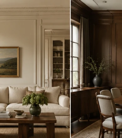
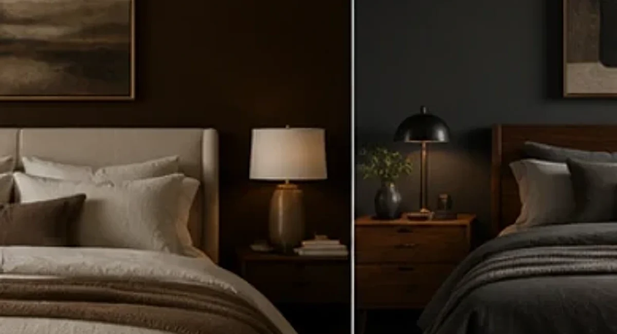
A moody bedroom does not have to feel dark, dramatic, or difficult to live in. The most successful versions use deeper color to create a sense of enclosure, then balance that depth with useful light, softer materials, and enough contrast to keep the room readable. The goal is not to make the room visually heavy. It is to make it feel intentional, calm, and a little more cocooning than a standard pale bedroom.
That distinction matters because “moody” is often interpreted too literally. Painting every surface nearly black, adding heavy curtains, and choosing dark bedding can produce a striking photograph, but it may also erase the architecture and make ordinary tasks harder. A more livable approach is to decide where you want visual depth, where you need lightness, and which materials should connect the two.
Bedrooms in 2026 are moving away from one-size-fits-all serenity. Recent design coverage has highlighted richer colors, more expressive headboards, layered fabrics, cocooning palettes, and rooms that feel personal instead of generically minimal. House Beautiful’s 2026 bedroom trend report points to deeper burgundy, enveloping drapery, and statement details, while Homes & Gardens notes warming earth tones, burgundy, mauve, and smoky blues among current bedroom color directions.
The ideas below are designed for real rooms, including spaces with ordinary ceiling heights, rental restrictions, existing furniture, and limited budgets. If you prefer a lighter base, our neutral bedroom ideas may be a better starting point. If you want a seasonal version of a deeper palette, see our new fall bedroom ideas.
1. Choose One Deep Color and Give It Enough Room to Work
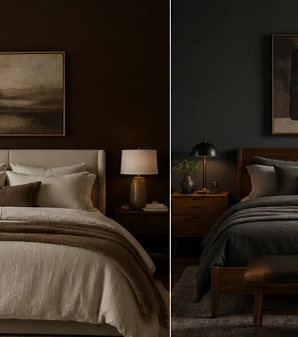
The first decision in a moody bedroom is not how many dark colors to use. It is which deep color will carry the room. Chocolate brown, charcoal, aubergine, deep olive, petrol blue, burgundy, and smoky navy can all create depth, but they behave differently with your floor, furniture, and daylight.
Look at the permanent elements before choosing paint. A honey-toned wood floor will interact differently with charcoal than a cool gray carpet. A walnut bed may disappear against a brown wall but stand beautifully against deep olive. White trim can create a crisp frame around a dark wall, while trim painted to match the wall creates a more enveloping effect. Neither is automatically better; the architecture should guide the choice.
If you are uncertain, start with one wall rather than assuming the entire room needs to be saturated. The wall behind the bed is usually the most logical place because the bed already creates a visual focal point. A deeper color there can anchor the room while the remaining walls stay lighter. Once you live with that contrast, you may decide the room wants more depth—or that one wall is enough.
Sample generously. A tiny paint chip is especially unreliable with dark colors because deep pigments change dramatically between daylight and artificial light. Paint a large removable board or a substantial test area and move it around the room. Look at it beside the bedding, wardrobe, floor, and curtains. A color that feels beautifully smoky on one wall may look unexpectedly purple, green, or flat on another.
For renters, the same principle can be applied without paint. A large upholstered headboard, full-width curtain behind the bed, oversized textile, or removable wallpaper can create one broad field of deeper color. Concentrating the mood in one large area usually looks more intentional than distributing many small dark accessories around the room.
2. Use Light Bedding to Create Breathing Room
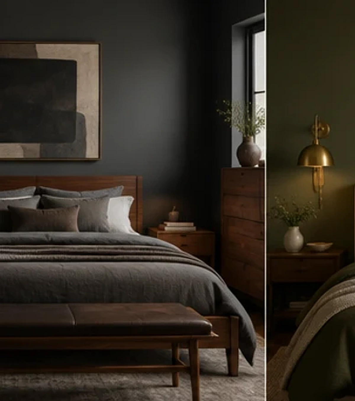
One of the easiest ways to keep a moody bedroom restful is to protect a large area of lightness. The bed is ideal because it occupies so much visual space. Cream, ivory, oatmeal, warm white, pale stone, muted blush, or soft gray bedding can create a clear contrast against deeper walls while still feeling warm enough for a cocooning room.
A completely white bed can look too sharp in some dark rooms, especially when the walls are warm brown or olive. In that case, choose off-white rather than optic white. The slight warmth helps the bedding connect to wood, brass, natural fibers, and warmer paint colors. You can then introduce the wall color back into the bed through a smaller throw or cushion so the contrast feels deliberate rather than disconnected.
Do not feel obligated to use dark bedding simply because the walls are dark. Dark-on-dark can be beautiful, but it removes one of the room’s biggest sources of visual relief. If you want the bed to be deeper, vary the value within the layers: charcoal duvet, lighter sheets, oatmeal blanket, and a warmer cushion, for example. That creates separation between the materials rather than one large dark block.
Texture becomes particularly important when the palette is restrained. Linen, washed cotton, wool, velvet, and quilted fabrics create subtle differences in how light falls across the bed. Those differences are more visible against deep walls, so you can achieve richness without adding many colors.
For practical styling, keep the everyday bed simple enough to reset. A moody room already has visual presence. It does not need excessive cushions to look finished. One long lumbar cushion, one pair of decorative pillows, or a folded throw can be enough. If the bed can be made quickly, the room is more likely to maintain the calm effect you intended.
3. Use Olive, Brown, and Warm Gray as Softer Alternatives to Black
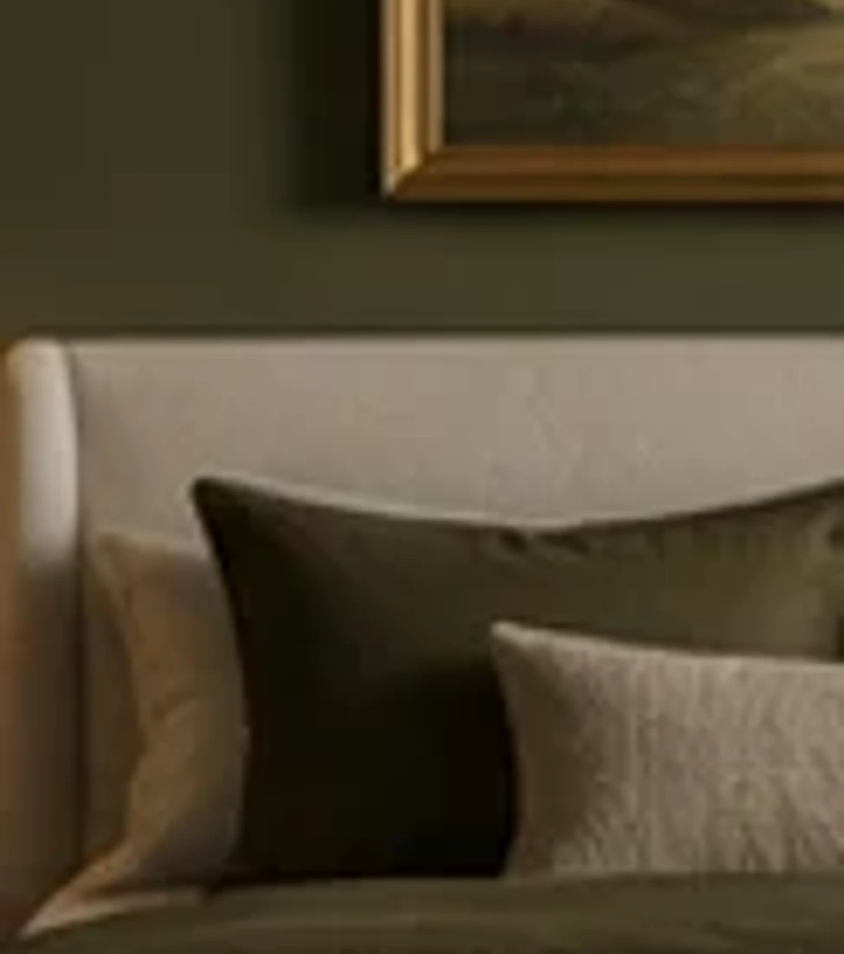
Black is not the only route to a dramatic bedroom. In many homes, complex mid-to-dark colors are easier to live with because they retain more visible undertone. Olive contains green and warmth. Chocolate brown can echo wood. Warm charcoal has a softer edge than blue-black. Mushroom and taupe can create quiet depth without reading as overtly dark.
These colors also make it easier to connect existing furniture. If you own oak, walnut, cane, or painted cream pieces, olive and brown often sit comfortably beside them. They feel grounded rather than high-contrast. That can be helpful when you are refreshing one room rather than furnishing it from scratch.
Try to avoid choosing a dark color in isolation. Place the paint sample next to the largest existing material in the room. If you have a warm wood bed, ask whether the wall makes the wood look richer or oddly orange. If the carpet is gray, check whether the paint emphasizes a purple or green cast you had not noticed before. A good moody color makes the fixed elements look more intentional.
Metal finishes can bridge the palette. Aged brass, bronze, blackened metal, pewter, and chrome can all work, but you do not need to match every fixture. A brass bedside lamp can warm a charcoal room, while darker metal can sharpen a warm brown wall. The finish should support the room’s balance rather than become a theme.
If you like a more natural result, repeat the deeper wall color in organic materials rather than exact matches. An olive wall can connect to mossy wool, green-veined stone, aged wood, and muted botanical art. A brown wall can relate to leather, walnut, rattan, and flax linen. The palette feels richer when the repetition happens through materials as well as paint.
4. Layer Texture So the Room Feels Rich, Not Flat
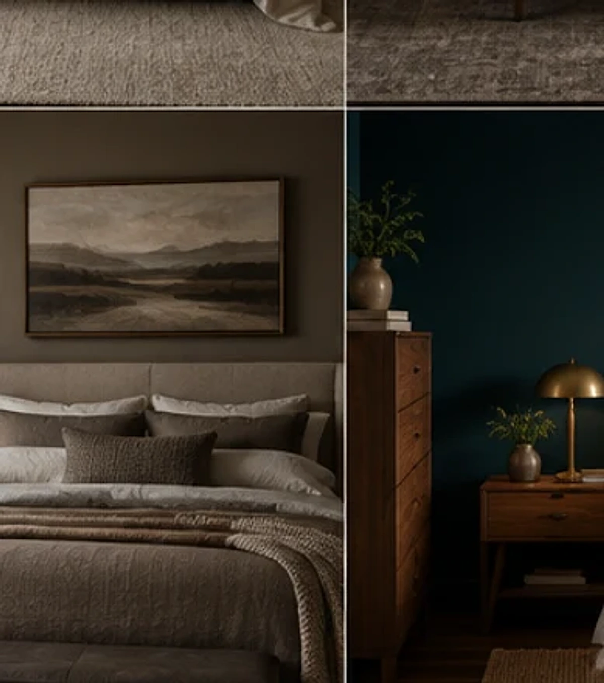
Dark rooms reveal texture differently from light rooms. A smooth charcoal wall, glossy metal lamp, crisp cotton sheet, and wool rug can all register clearly because the contrast between surfaces becomes more noticeable. That is an advantage. You can keep the color palette relatively tight while still making the room feel layered.
Begin with the largest soft surfaces. Curtains, bedding, rugs, and an upholstered headboard can contribute more to the mood than small accessories because they occupy more visual area. If the walls are matte, a slightly lustrous velvet cushion or satin-trimmed shade can add dimension. If the bed is very soft and layered, a cleaner wood bedside table can provide necessary structure.
Use tactile contrast rather than maximum texture. A bouclé chair, thick shag rug, heavily fringed curtain, velvet headboard, quilted bedspread, and chunky knit blanket may all be attractive individually, but together they can make the room feel visually congested. Choose one or two highly tactile materials, then let the rest support them.
Natural fibers are useful because their irregular surfaces soften strong color. Linen curtains against burgundy walls, a wool rug below a dark bed, or a woven shade beside charcoal paint can prevent the room from feeling overly polished. That slight variation makes the space feel lived-in.
The headboard is another opportunity. In a pale bedroom, a dramatic headboard may be the primary focal point. In a moody room, it can either contrast with the wall or almost disappear into it. A cream headboard against brown creates a strong frame around the bed. A rust velvet headboard against burgundy feels tonal and enveloping. A dark wood headboard against olive brings the palette back to natural materials. Choose the relationship you want rather than treating the headboard as a separate shopping decision.
5. Add One Cooler Accent to Keep Warm Dark Colors From Feeling Heavy
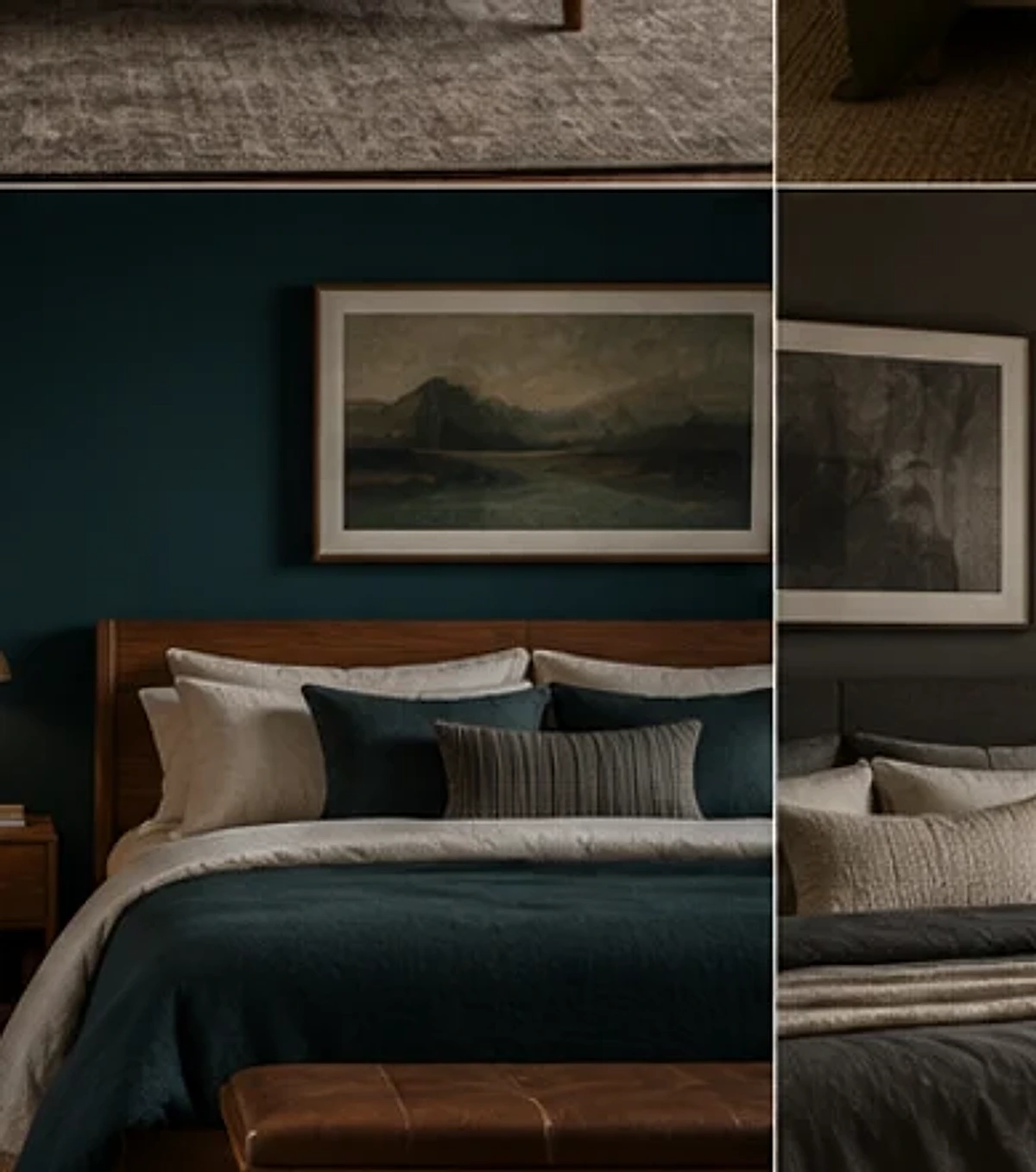
Warm moody palettes are popular because brown, rust, burgundy, and olive feel grounded and comfortable. But a room built entirely from warm dark colors can lose definition. A small cooler note can sharpen the scheme and make the warmer colors look richer.
This does not mean adding bright blue to a brown room. The cooler accent can still be subdued: smoky teal, dusty blue, blue-gray, muted lilac, pewter, or a green with a cooler undertone. The amount can be modest. Artwork, one cushion, a lampshade, a ceramic object, or a small area in a rug may be enough.
The reverse also works. If the room is built around navy, petrol, or smoky blue, introduce warmth through walnut, brass, camel, rust, or cream. The contrast should feel balanced, not competitive. One temperature usually needs to remain dominant while the other provides relief.
Look for the accent in something you already own. A favorite painting may contain the exact secondary color the room needs. A rug may already combine burgundy, blue, and cream. A book cover, textile, or ceramic object can suggest a palette that is more personal than a trend forecast.
This is also where a moody room can become more individual. Deep colors create a strong background for art, photographs, vintage frames, and objects with patina. Rather than filling the walls, choose a few pieces that are large enough to hold their own against the color. A small frame can disappear on a dark wall, while a larger print with a light mat can create useful contrast.
6. Brighten the Window Area Without Losing the Cocooning Effect

A moody bedroom still needs daylight. In fact, daylight becomes more important because deep colors absorb more light than pale ones. The window treatment should allow you to control privacy and darkness without making the room feel permanently closed.
If you use blackout curtains, consider whether the fabric itself needs to be dark. A pale or mid-tone curtain can still include a blackout lining. This allows the room to feel lighter during the day while providing darkness when you need it. Ivory, flax, warm gray, muted stripe, or a subtle pattern can work particularly well against deep walls.
Full-length curtains can soften a strong paint color because they interrupt the wall with a large vertical area of fabric. If the room is small, choose a material with enough drape to feel generous but not so much bulk that it projects deeply into the floor area. The curtain should stack away from the glass sufficiently to preserve daylight.
Mirrors can also help around the window, but placement matters. A mirror that reflects the window can distribute daylight visually, yet it may also reflect an unattractive view, television, or cluttered surface. Check the reflection from the bed before fixing anything to the wall.
During the evening, the window becomes a dark rectangle unless it is covered. That is one reason curtains have such a strong effect in a moody bedroom. Once closed, they become part of the palette and can either deepen the room or provide a large area of relief. Treat them as one of the primary color decisions, not an afterthought.
How to Make a Moody Bedroom Feel Restful Instead of Dramatic
The difference often comes down to contrast and editing. A restful room has clear places for the eye to stop. The bed may be light against dark walls, the bedside lamps may create gentle pools of illumination, and the artwork may be limited to a few deliberate pieces. A dramatic room often asks every element to compete.
Keep the strongest moments separated. If the walls are deep burgundy, you may not need a heavily patterned rug, sculptural canopy, gallery wall, and ornate chandelier at the same time. Choose the feature that matters most, then allow other elements to support it.
Sound, temperature, and clutter also affect how the room feels, even though they are not visual design choices. Make sure the deeper palette is not being asked to compensate for practical discomfort. A beautiful dark room with nowhere to put a glass of water or with harsh overhead light will not feel restful.
For a softer approach to comfort, our guide to cozy bedroom ideas focuses on the functional details that make a bedroom easier to use every day.
Moody Bedroom Ideas for Small Spaces
Small bedrooms can handle deep color, but the distribution matters. If you paint every surface dark, keep the bed, curtains, or floor comparatively light so the room retains definition. If you prefer light walls, introduce mood through the headboard wall, textiles, and lighting instead.
Use fewer pieces at a slightly more confident scale. One substantial bedside lamp may look calmer than several tiny decorative objects. A single large artwork can create more impact than a crowded gallery. A bed with one strong textile layer can feel richer than many small cushions.
Keep storage visually quiet. Closed drawers and cabinets can be particularly useful in a dark small room because visual clutter becomes more noticeable against strong color. If storage is open, edit what is displayed and repeat containers or materials to create order.
Do not sacrifice circulation for atmosphere. Leave the main route around the bed clear, make sure wardrobe doors can open, and avoid placing a floor lamp where you have to step around it. A moody bedroom should feel enveloping, not obstructed.
Where to Spend and Where to Save
Spend first on the elements that define the room every day: paint if the existing wall finish is poor, curtains if privacy or light control is inadequate, a bedside lamp if the current lighting is frustrating, or bedding if comfort is the problem. These choices influence both function and appearance.
Save on decorative layers. Vintage frames, secondhand bedside tables, existing books, cushion covers, and artwork you already own can look newly relevant against deeper walls. A moody palette often makes familiar objects feel more considered because the background changes their context.
If you are unsure about a dark color, do not spend heavily on matching accessories before the wall is finished. Live with the color first. You may discover that the room needs less decoration than you expected.
Common Moody Bedroom Mistakes
The first mistake is making everything dark. Without contrast, the room can lose hierarchy. The second is using insufficient lighting and assuming the darkness itself creates atmosphere. Mood depends on being able to see the materials and objects you chose.
Another mistake is choosing a color only because it looks good online. Your room’s orientation, flooring, furniture, and artificial light can change it dramatically. Test large samples and judge them in your own space.
Finally, avoid forcing every item into the same style. Moody does not mean gothic, traditional, modern, or luxurious by definition. A dark room can contain a clean-lined bed, vintage chest, striped linen, contemporary art, and a simple lamp if the colors and proportions connect. Let the room reflect your taste rather than a label.
Frequently Asked Questions
What colors work best for a moody bedroom?
Chocolate brown, charcoal, olive, burgundy, aubergine, petrol blue, smoky navy, warm gray, and deep teal are all useful starting points. The best choice depends on your existing floor, furniture, daylight, and the amount of contrast you want.
Will dark walls make a small bedroom look smaller?
They can reduce visible contrast at the edges of the room, but that is not necessarily a problem. Small rooms can feel intentionally cocooning with deep walls. Keep some lighter elements, preserve useful lighting, and avoid overfilling the floor area.
What bedding works with dark bedroom walls?
Cream, ivory, oatmeal, pale gray, muted blush, and soft stone create contrast without feeling stark. You can also use dark bedding if you vary the values and textures so the bed does not become one flat block.
Should the ceiling be dark too?
Only if you want a fully enveloping effect and the room can support it. Painting the ceiling to match can be beautiful, but it is a strong decision. Test the walls first and consider ceiling height, natural light, and how much contrast you want around the room’s edges.
How do I keep a moody bedroom from looking gloomy?
Use layered lighting, pale or mid-tone textiles, warm wood, reflective details in moderation, and enough clear space around furniture. A dark palette should feel deliberate, not underlit.
Can I create a moody bedroom without painting?
Yes. Use a deep upholstered headboard, large textile, removable wallpaper, darker curtains, a substantial rug, artwork, and layered lighting. Concentrating color in a few larger areas will feel more intentional than scattering many small dark objects.
How to Choose a Deep Color for the Light in Your Bedroom
Dark colors become much easier to choose when you begin with the room’s light rather than a favorite paint swatch. A north-facing room often receives cooler, flatter daylight, so a color with a little warmth can prevent the space from feeling severe. Chocolate, warm charcoal, muted burgundy, mushroom, and olive may hold their character better than a very blue black. By contrast, a bright south-facing bedroom can usually handle cooler or deeper tones without losing as much definition during the day.
East-facing bedrooms change dramatically from morning to evening. A color that looks luminous at breakfast can become much denser after sunset. If you spend most of your bedroom time in the evening, make the final decision under artificial light rather than choosing solely from the morning view. West-facing rooms have the opposite rhythm: they can feel quieter earlier in the day and much warmer late in the afternoon, which may intensify brown, rust, or red undertones.
The practical solution is to test the paint beside the materials that will remain in the room. Hold or paint the sample next to the headboard, floor, curtains, and largest wood finish. Then switch on the lamps you actually use. If the color only looks good under one condition, keep searching. A successful moody color should retain a pleasing relationship with the room across the times of day that matter to you.
Do not chase a precise paint name from an online photograph. Camera settings, editing, screen brightness, and the surrounding architecture all change how a color appears. Use inspiration images to identify the family you like—brown, olive, burgundy, blue, charcoal—then choose the exact shade in your own room.
Moody Bedroom Ideas Without Painting the Walls
Painting is only one way to create visual depth. If you rent, expect to move soon, or simply prefer a lighter wall color, build the mood through large removable elements. A tall upholstered headboard in olive, brown, burgundy, or charcoal can create almost as much visual impact behind the bed as an accent wall. A wide curtain panel hung behind the bed can do the same while adding softness.
A rug is another powerful surface because it connects the bed and surrounding furniture. A faded Persian-style pattern, deep solid wool rug, or subdued geometric design can establish the palette from the floor upward. Choose a rug with enough lighter detail that it does not become a dark hole beneath the bed, especially in a small room.
Curtains can carry more color than many people expect. Deep green, rust, charcoal, or patterned drapery can make white or cream walls feel far more enveloping after sunset. If you need the room to remain bright during the day, make sure the curtains open fully away from the glass. The goal is to control the mood, not reduce daylight permanently.
Artwork, bedding, and lighting can complete the effect. One large artwork with deep tones will usually create more presence than many small dark prints. A substantial throw can repeat the dominant color across the bed. A sculptural lamp with a fabric shade can bring both silhouette and warm light. Together, these elements can produce a genuinely moody room without touching the walls.
A Step-by-Step Plan for Building a Moody Bedroom
Start by photographing the room in daylight and at night. The photographs help you notice where the room already has strong contrast, where visual clutter gathers, and which existing materials dominate. Write down the three items you are definitely keeping. Those pieces become the anchors for the new palette.
Next, choose the deepest color and one light counterpoint. For example: chocolate and ivory, olive and flax, burgundy and stone, charcoal and oatmeal, or petrol blue and cream. Add a third supporting material rather than another paint color—usually wood, aged metal, woven fiber, or a restrained pattern. This three-part foundation is easier to control than a long list of coordinated shades.
Make the largest change first and pause. If you are painting, finish the wall before ordering accessories. If the headboard is the main change, place it before choosing the rug. If the rug sets the palette, lay it down before deciding on curtains. Each large element changes how the next one reads, so buying everything at once increases the chance of unnecessary returns or a scheme that feels overplanned.
Once the main surfaces are working, set up the lighting and live with the room for several evenings. Only then add decorative details. This is the stage where many rooms need less than expected. A deeper wall may make the existing art look newly interesting; a warm lamp may eliminate the need for additional color; a lighter duvet may provide all the contrast the room needs.
Finish by editing. Remove anything that looks accidental against the stronger palette, but do not strip the room of personality. A moody bedroom should still contain the books, photographs, art, and objects that make it yours. The background is there to give those things more presence, not to replace them with a rigid theme.
Three Moody Bedroom Palettes That Are Easy to Adapt
Chocolate Brown, Cream, and Walnut
This palette is warm, grounded, and relatively easy to integrate with existing wood furniture. Use cream or warm white on the bed, medium-to-dark walnut for structure, and chocolate on the wall or headboard. Aged brass, muted olive, or a small blue-gray accent can keep the scheme from becoming too monochromatic.
Olive, Flax, and Blackened Metal
Olive provides depth while still feeling connected to natural materials. Flax linen curtains or bedding keep the room soft, and blackened metal adds a sharper line through lamps, frames, or hardware. This combination works particularly well with oak, cane, leather, and warm stone.
Petrol Blue, Oatmeal, and Warm Wood
Petrol blue is deep enough to feel moody but contains enough color to remain lively. Oatmeal bedding provides a gentler contrast than bright white, while warm wood prevents the blue from feeling cold. A small rust or burgundy accent can add another layer without turning the palette busy.
How to Maintain a Darker Bedroom So It Still Feels Calm
Deep walls and dark textiles make dust, lint, and clutter visible in different ways from pale rooms. Choose surfaces you are willing to maintain. Very dark glossy furniture may show fingerprints; black bedding may show lint; velvet can reveal pressure marks. None of these materials are inherently impractical, but understanding their maintenance helps you decide where they belong.
Keep horizontal surfaces relatively clear. A dark bedside table crowded with cables, bottles, books, and small objects can quickly look visually heavy. Use a drawer, tray, or small box for the items you need but do not want to display. Leave enough open space around the lamp so the light can become part of the composition.
Review the room when seasons change. A moody palette does not require a winter-only bedroom. In spring and summer, lighter linen, fewer bedding layers, fresher artwork, and brighter window treatments can shift the same deep walls into a different mood. The color can remain while the textiles and light change around it.
Final Thought
A moody bedroom works when depth and comfort are balanced. Choose one strong color direction, protect some areas of lightness, and let texture, wood, curtains, and lighting create the rest of the atmosphere. The room should still be easy to move through, easy to reset, and comfortable at the end of a normal day. When the practical foundation is right, deeper color can make a bedroom feel not gloomy, but grounded, personal, and genuinely restful.
Other Articles

Bedroom Lighting Ideas for a Warm, Restful Room
Fall Bedroom Ideas for a Cozy, Layered Retreat