


A neutral bedroom can feel rich and personal without relying on a strong accent color. The interest comes from smaller differences: the grain of a walnut cabinet beside pale bedding, the irregular weave of a curtain, or the outline of a darker frame against a creamy wall. When those differences are chosen deliberately, a quiet palette does not have to look unfinished.
The difficulty is that neutral colors are not automatically compatible. A beige headboard, gray carpet, and white duvet may each look appealing separately yet seem disconnected together. Rather than buying more accessories to bridge the gap, begin by deciding which existing finish will lead the scheme.
This guide focuses on six decisions that make neutral bedroom ideas easier to apply: tonal structure, undertones, fabric texture, contrast, lighting, and personal details. You can work through them with the furniture you already own. The result should have enough variety to feel interesting, with enough continuity to remain calm.
In this guide
1. Give the Palette a Light, Middle, and Deeper Tone

Start by assigning roles rather than choosing a long list of shades. A light background can cover the walls and curtains; a middle tone can appear on the headboard or coverlet; a deeper tone can ground the arrangement through wood or a folded throw. This makes the composition easier to understand from the doorway.
An example might be warm ivory walls, oatmeal upholstery, and caramel fabric. Another could combine pale greige, mushroom, and dark walnut. These are possible directions, not formulas that every room must follow. The floor and any large pieces you are keeping should influence which version makes sense.
Look for enough difference between adjacent surfaces. If the duvet, bed frame, and wall are nearly identical in both color and texture, their edges can disappear visually. Changing one layer to a slightly deeper tone may supply the separation you need without creating a dramatic contrast.
Choose the main bedding layer with everyday use in mind. Consider washing, pets, and whether you prefer a crisp or relaxed appearance. A neutral bedroom should not become a room where every daily mark feels like a design failure.
Before purchasing: lay your three proposed tones together beside the existing floor. If one looks unrelated, adjust that piece before building an entire scheme around it.
2. Compare Neutrals Side by Side Instead of Trusting Their Names
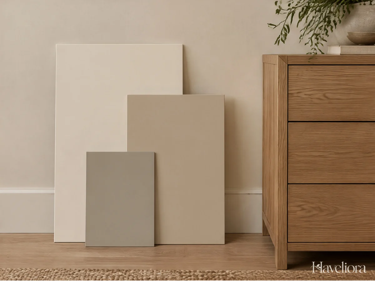
Words such as cream, stone, linen, and greige describe a broad impression rather than an exact relationship. Two products with similar names can lean noticeably different ways when placed together. Use physical samples wherever possible and compare them in the bedroom, not only under shop lighting.
Begin with the hardest-to-change surface. If the carpet is staying, choose fabrics and paint that sit comfortably beside it. If a large wood bed dominates the room, let its finish guide the next decisions. It is generally easier to change a cushion cover than to make an entire room compensate for a fixed surface you have ignored.
Check samples in more than one position. Hold a curtain fabric vertically, place bedding horizontally, and move a paint sample near the headboard and window. Materials will not always look identical when light reaches them from different angles.
Do not reject every difference. A neutral scheme needs variation, and a slightly unexpected piece can provide character. Ask whether the difference feels deliberate. If a cool white duvet makes all the warmer furniture look oddly yellow to you, try an alternative before assuming the furniture itself is wrong.
A simple comparison kit: keep a small flooring or furniture sample, one bedding swatch, and a photograph of the room together while shopping. Use the photograph for context rather than exact color matching.
3. Let Texture Supply the Detail That Color Does Not
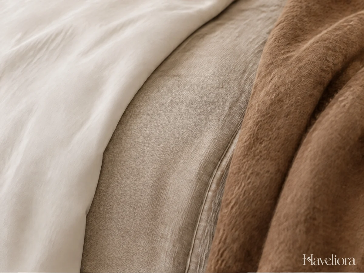
A restrained palette becomes more interesting when the materials behave differently. Smooth cotton, softly creased linen, a quilted coverlet, and a knitted throw each introduce a distinct surface. You do not need all four; a contrast between two or three can be enough.
Use texture at different scales. A large plain duvet can support a more pronounced knit at the foot of the bed, while a subtle woven cushion supplies a smaller detail. If every fabric has a heavy texture, the arrangement may feel as busy as one with several strong patterns.
Consider maintenance as part of the design. Check care instructions, how the fabric feels against skin, and whether loops or loose weaves suit your household. A cover that looks beautiful but is unpleasant to use will eventually be pushed aside. Comfort should determine the main bedding, with decorative texture added only where it makes sense.
Keep the quantity manageable. If extra cushions have no clean place to go at night, reduce them. Fold the blanket so part of the main cover remains visible. The layers should read as a purposeful arrangement rather than a display of every neutral fabric you own.
Try this first: place a textured throw you already have against the bedding. If the bed immediately looks more complete, you may not need additional decorative pieces.
4. Use a Deeper Finish to Give the Room an Outline
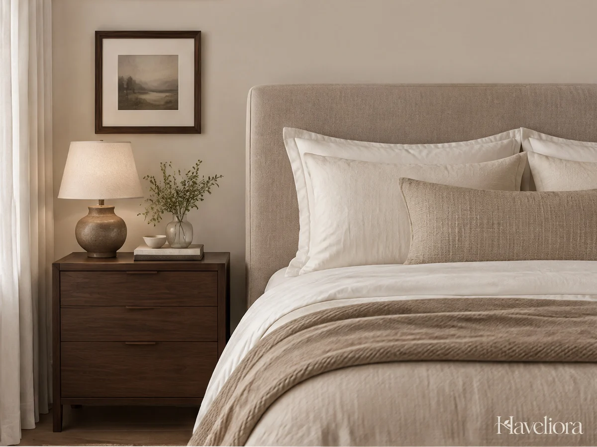
A small amount of depth can make light neutrals feel more intentional. This might come from walnut furniture, dark bronze lighting, a charcoal line in artwork, or a deeper brown coverlet. Choose something that has a useful role rather than adding dark objects simply to meet a decorating rule.
Repeat the deeper tone once elsewhere to create a connection. A walnut nightstand can relate to a picture frame across the room. A dark lamp base might echo the edge of a mirror. The repeated detail can be small; equal quantities are not necessary.
Pay attention to distribution. Putting every dark object on one side may make the room feel visually unbalanced. Move one small item before buying something new. Sometimes the contrast you need already exists, but it is hidden behind the bed or grouped entirely on one surface.
Black is not the only option. Brown, muted bronze, or a deeper version of your main neutral can create definition while preserving a softer overall effect. Choose the degree of contrast that you enjoy in the room’s actual light.
Editing check: step back and identify the first thing you notice. If it is a dark accessory you did not intend as a focal point, reduce its size, change its position, or choose a quieter finish.
5. Judge Curtains, Paint, and Lamps as One Arrangement
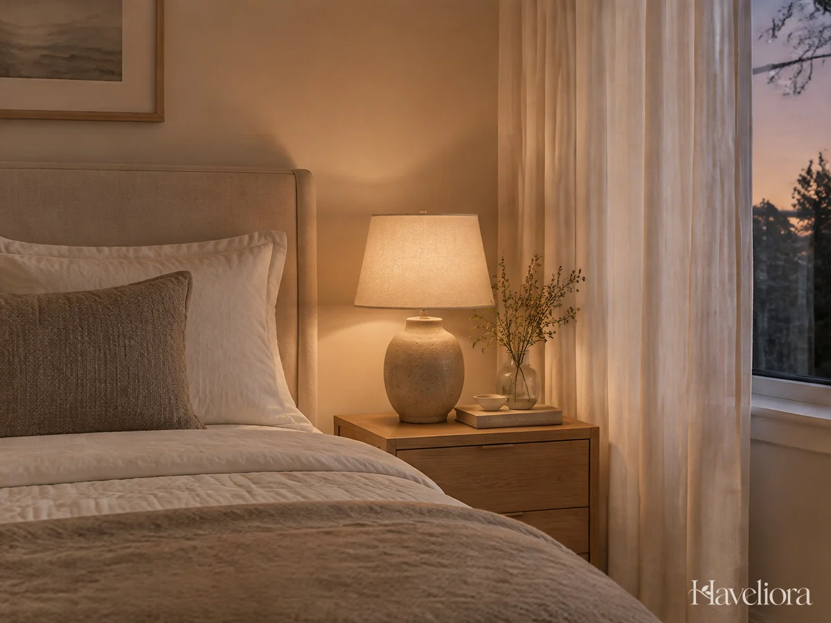
The room you see at noon is not the same composition you experience before bed. Curtain fabric filters the daylight, while lamps affect how the walls and textiles appear in the evening. Make decisions with both conditions in mind rather than finishing the color scheme and treating lighting as an afterthought.
For a warm-looking starting point, the Department of Energy describes 2700 K and 3000 K as warm and soft color-temperature options. Brightness is a separate choice. Check the fixture’s specifications and use compatible bulbs and dimmers.
Try a shade that diffuses the bulb rather than leaving glare directly in your eyeline. Sit on the bed to assess it. A lamp can look balanced on the table while feeling uncomfortable from the position where you actually use it.
Choose curtains for function as well as color. A sheer neutral fabric may require another layer for privacy or darkness. Measure the drop and ensure open panels do not unnecessarily cover the glazing. Keep fabric clear of heaters and ventilation.
Final sample test: bring the curtain and bedding samples together beside a lamp in the evening. Make adjustments before committing to the largest fabric purchase.
6. Keep the Room From Becoming a Neutral Showroom
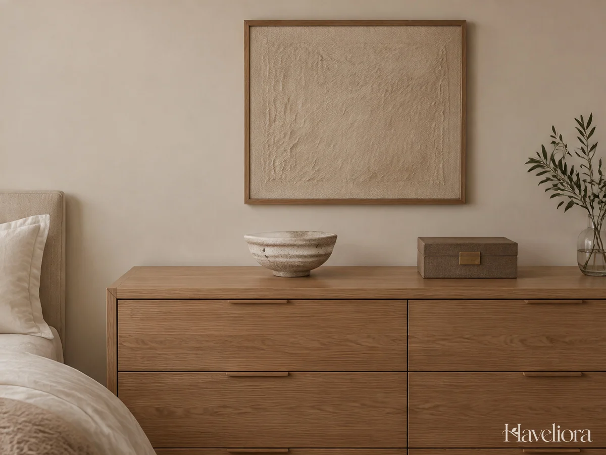
Matching the colors does not automatically make a room feel like yours. A book you enjoy, a handmade bowl, an inherited box, or an original piece of art can give the bedroom a reason to look the way it does. Choose a few details with meaning rather than filling every surface with coordinated accessories.
Let useful pieces participate. A ceramic bowl can hold jewelry; a small box can organize everyday necessities. Objects that support your routine are more likely to remain part of the room than a complicated decorative arrangement that has to be moved constantly.
Vary shape and height within a small grouping, then leave some surface empty. The space around an object helps it stand out. A dresser does not need a lamp, plant, tray, candle, book stack, and sculpture simply because all of them appear in inspiration photographs.
Allow a little imperfection in the palette. A favorite object does not have to match the bedding exactly to belong. Its placement can make the connection clear, or a small related tone elsewhere can help integrate it without disguising its character.
One useful question: would you keep this piece if you changed the room’s colors? If the answer is yes, give it a deliberate place rather than hiding it among generic decoration.
Three Neutral Directions to Adapt
Light and warm: combine ivory, oatmeal, pale oak, and a caramel detail. Use smooth bedding with a woven curtain and one textured blanket. This is a gentle starting point for a room where you want the furniture and daylight to remain prominent.
Soft and earthy: work with mushroom, stone, walnut, and a muted clay accent. Keep enough lighter fabric around the bed to separate it from the darker wood. A plain rug can prevent the material mix from feeling overly busy.
Quietly contrasted: pair pale greige and cream with a little dark bronze or charcoal. Repeat the darker finish selectively through a lamp and frame. These examples describe relationships rather than exact product colors; test your own combination in the room.
Frequently Asked Questions
Can I mix white and cream?
Yes, if you like how they look together. Compare the actual fabrics and finishes rather than assuming all whites match. A deliberate difference can look layered, while two almost-identical shades may bother you more than a clearer contrast.
How do I add interest without adding color?
Vary texture, depth, and shape. Try a woven throw against smooth bedding, a wooden cabinet beside upholstery, or a rounded lamp among rectangular furniture. Change one variable at a time so you can see which difference helps.
What if my bedroom is also very small?
Prioritize a workable layout and reduce the number of separate decorative details. Our small bedroom ideas focus on circulation and storage. For broader comfort choices, see the cozy bedroom guide.
A successful neutral bedroom has variety without constant competition. Let the fixed finishes guide the colors, choose fabrics you enjoy using, and leave room for a few objects that make the space unmistakably personal.
Other Articles

Cozy Living Room Ideas for a Home You Can Actually Relax In
Small Bedroom Ideas That Make Space for Everyday Living


