“Afrohemian” is Pinterest’s 2026 label for a layered interior trend that brings African design references into conversation with the relaxed, collected character often associated with bohemian rooms. The useful part of the trend is not a recipe of baskets, prints and carved objects. It is an invitation to build rooms around specific textiles, artworks, furniture and craft traditions while allowing them to coexist with pieces collected from other periods and places.
That distinction matters because Africa is not one design style. A Yoruba adire textile from southwestern Nigeria, a Moroccan Berber weaving, contemporary Ethiopian art and a rattan chair do not come from one visual language or one cultural context. Pinterest’s 2026 trend report groups searches such as “afrobohemian home decor,” “adire fabric,” “motif berbere,” “Ethiopian art,” “bamboo beaded curtains” and “rattan accent chair” under the Afrohemian label, but a thoughtful home should keep those references specific rather than flattening them into generic “tribal” decor. Pinterest reports year-over-year search growth of +220% for “afrobohemian home decor,” +130% for “adire fabric,” +210% for “motif berbere,” +50% for “Ethiopian art,” +60% for “bamboo beaded curtains” and +50% for “rattan accent chair.” See the Pinterest Predicts 2026 trend report for the source data.
Begin with specific objects instead of a generic theme
The easiest way to avoid a themed room is to begin with one or two objects you genuinely value and know something about. That might be a documented indigo textile, a work by a contemporary artist, a handmade basket bought directly from a maker, a vintage stool with known provenance or a ceramic piece connected to a particular place.
Ask what the object is, not what “look” it creates
Learn the material, technique, origin and maker where that information is available. A textile becomes more meaningful when you know whether it is resist-dyed cotton, woven wool, printed cloth or embroidery rather than treating every patterned fabric as interchangeable. This information also helps with care: strong sunlight, cleaning methods and display techniques vary by material.
Let one object carry the strongest pattern
A room does not need six “global” prints to feel layered. A single large textile behind a sofa, one patterned rug or one strong piece of art can establish the visual direction while quieter wood, linen and plaster give it space.

This approach is closely related to Haveliora’s collected interior style: personal context and useful furniture create character more convincingly than buying a coordinated set of decorative objects.
Build a provenance note for important pieces
For a textile, artwork or vintage object that matters to you, keep a short record of where it was purchased, the seller or maker, the material and any care information that came with it. This prevents the object from losing its context as it moves through the home and makes future repair, framing or resale easier. A digital note is enough; the point is to preserve information rather than turning the room into a museum label.
This habit is particularly useful when several design traditions appear in one room. It lets each object retain its own identity even when the overall interior is visually eclectic.
Use textiles as the main pattern layer
Textiles are one of the most flexible ways to bring history, color and handwork into a room because they can be used on cushions, throws, wall hangings, upholstered seats or table linens without requiring permanent construction.
Understand adire before using the reference
Adire is a Yoruba resist-dyed textile tradition associated especially with southwestern Nigeria. The Metropolitan Museum of Art and the Smithsonian National Museum of African Art describe historic adire techniques that use indigo dye and resist methods to create patterned cotton cloth. The specific motifs, makers and production histories vary; the term should not be used as a generic label for any blue-and-white pattern. See the Met’s African textiles material and the Smithsonian NMAfA adire object record.
Mix pattern by scale rather than origin
If one textile has a dense repeat, pair it with a calmer stripe, solid linen or subtle weave rather than adding another equally active surface. This lets distinct pieces coexist without pretending that they form a traditional matched set.
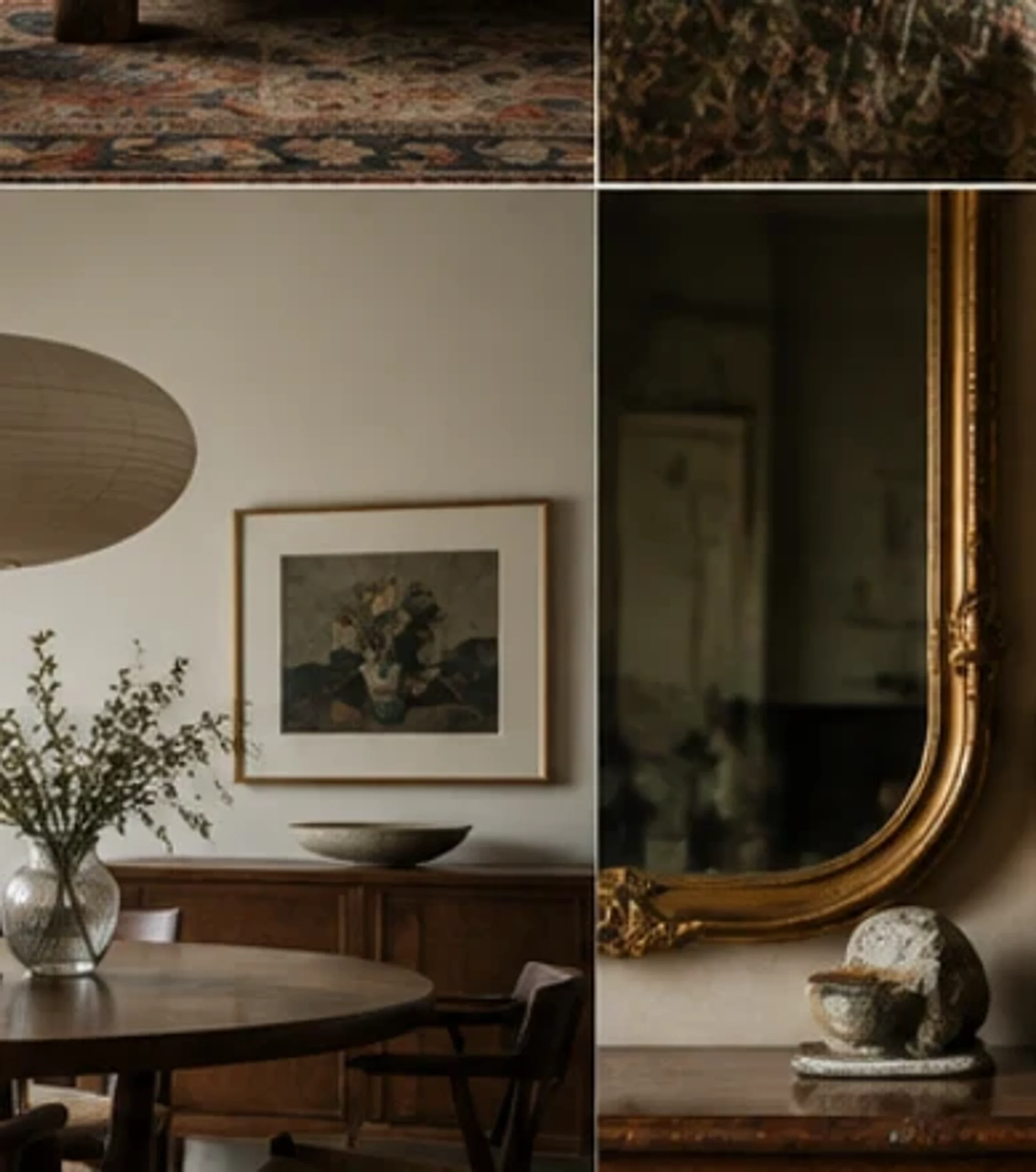
Use removable textile layers where possible. A cushion cover or throw can be cleaned, repaired or rotated more easily than a heavily patterned permanent wall treatment, and the room can evolve as the collection changes.
Display textiles in ways that protect them
Not every cloth is suited to a sofa cushion or heavily used upholstery. Older, delicate or highly valued textiles may be better framed, mounted or draped in a low-contact location. Avoid strong direct sun when fading is a concern, and do not cut a significant textile simply to make it fit a decorative pillow if a reversible display method would preserve more of the original piece.
For functional upholstery, choose fabric whose strength and care requirements match the use. A room can still carry the color and rhythm of a textile tradition through a throw or wall piece while the sofa uses a durable plain cloth.
Balance pattern with quiet natural materials
Rooms with expressive art and textiles need places for the eye to rest. Plaster, matte paint, natural wood, linen, wool, sisal and simple ceramics can create that quiet structure.
Use wood for warmth rather than “ethnic” symbolism
A carved stool or timber side table should be chosen because its shape, material and craftsmanship suit the room, not because dark wood is being used as shorthand for an entire continent. Mix carved or handmade pieces with cleaner contemporary furniture so each object remains legible.
Let walls stay simple when the collection is strong
Warm white, clay, sand, muted olive or another low-chroma wall color can support saturated indigo, rust, ochre and black without making the room feel busy. If the architecture already contains strong color, use fewer patterned furnishings.

Use texture at different visual weights
Woven fiber, carved wood, rough ceramic and linen can all add texture, but placing every tactile material in the same area makes the room feel dense. Spread texture across the composition: perhaps a sisal or wool rug on the floor, a smooth sofa at mid-height and a woven pendant above. The variation helps the eye move through the room without turning one corner into a pile of “natural” materials.
Smooth surfaces also matter. Glass, polished metal or a clean painted cabinet can provide useful contrast and keep the room from feeling visually dusty or heavy.
Make art feel collected, not tokenized
Art is one of the places where cultural specificity matters most. Rather than buying an anonymous “African wall art” print, look for work by identifiable artists, galleries, cooperatives or reputable dealers that provide information about the maker and medium.
Give one large work enough space
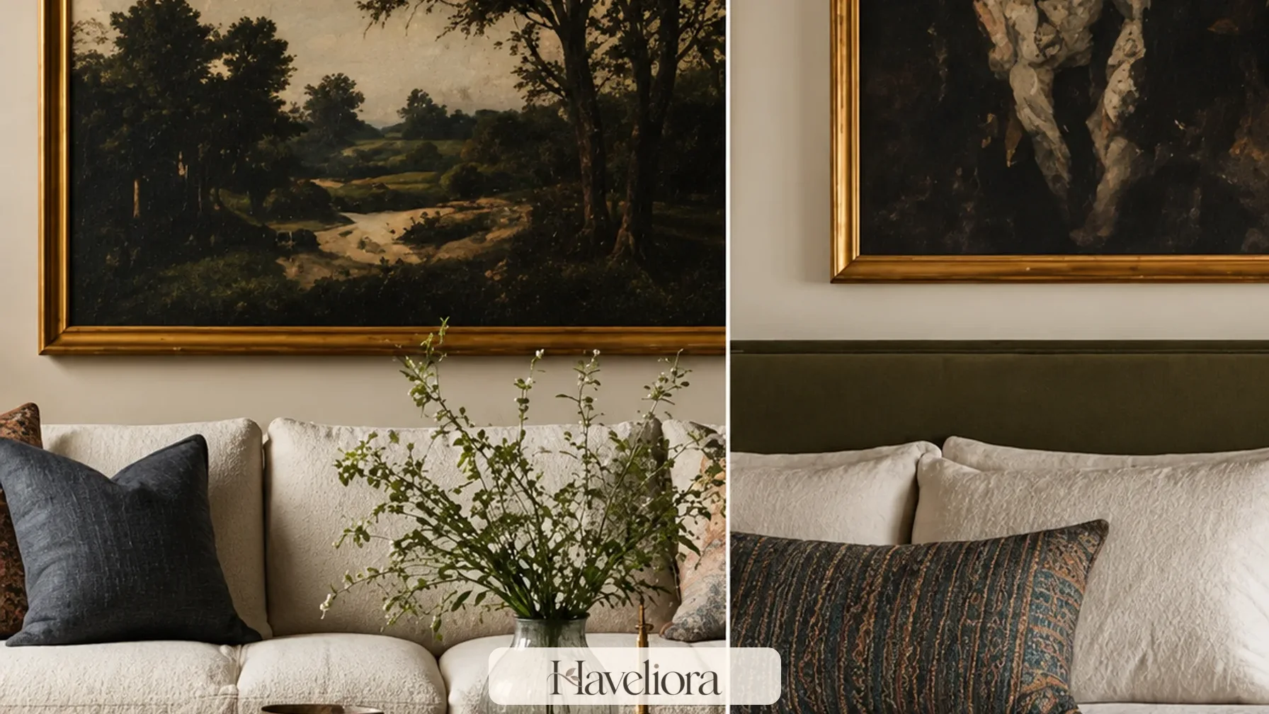
A strong painting, photograph or textile can hold a wall on its own. Surrounding it with many unrelated objects may dilute its impact and turn meaningful work into part of a generic gallery-wall formula.
Mix contemporary and older work carefully
A contemporary painting can sit beside a vintage textile or inherited furniture without requiring every object to share an era. Connect them through scale, color or material rather than claiming they come from one tradition.
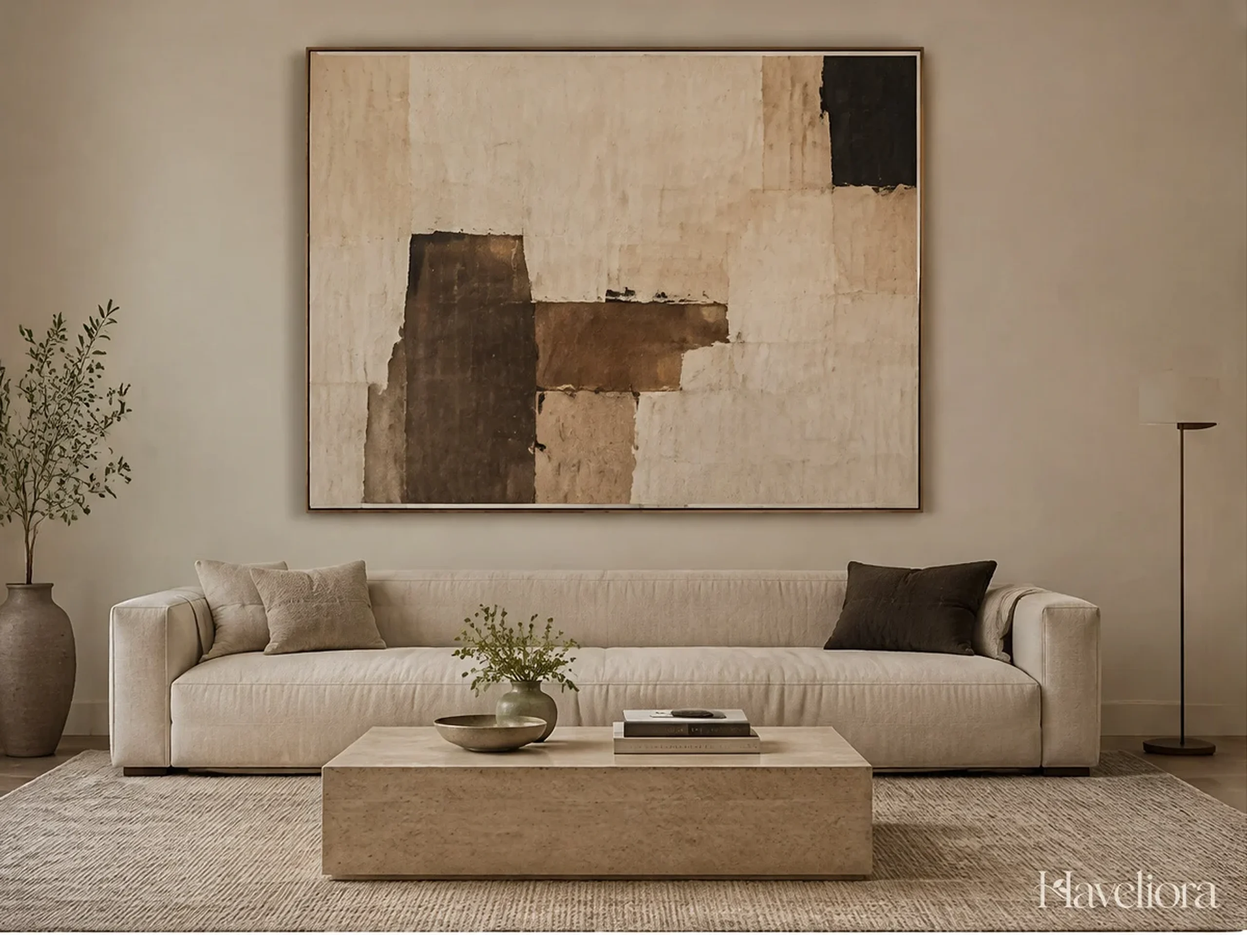
If you like rooms that develop this way over time, Haveliora’s collected living room ideas offers a practical framework for editing art, books and objects without losing usable surfaces.
Frame and hang art according to the work
A textile may need different mounting from a painting, and a photograph may benefit from glazing or a mat. Do not force every piece into identical black frames simply to create a coordinated gallery wall. Consistency can come from spacing and alignment while the framing responds to the medium.
Give large work enough wall around it. If a piece is visually dense, empty wall can become part of the composition. That negative space is especially valuable in a layered room because it prevents meaningful art from becoming just another pattern.
Let color come from materials as well as paint
An Afrohemian room does not need a saturated wall color to feel expressive. Indigo cloth, reddish-brown wood, terracotta, natural fiber, aged brass, dark metal and green plants can create a rich palette against quiet walls.
Indigo works best with breathing room
Deep blue becomes more distinctive when it appears in one or two places rather than on every cushion. Pair it with warm wood, cream linen or clay so the contrast remains clear.
Use earth tones with variation
Terracotta, tobacco, ochre and rust can become heavy if every item has the same value. Mix pale natural fiber, mid-tone wood and a few deeper accents so the room retains light.
Black can sharpen the composition
Thin black frames, a dark metal lamp or one ebony-toned furniture element can give structure to a room filled with softer woven surfaces. Use it as punctuation rather than a dominant theme.
Test the palette in daylight and evening light
Indigo, terracotta and deep brown can shift dramatically under warm artificial light. View textile and paint samples in the room at different times of day before matching additional objects to them. A blue that looks crisp in daylight may read nearly black at night, while a warm clay wall can intensify the orange in nearby wood.
The solution is not to force every color to match. Use light to preserve distinctions between materials. A shaded lamp near a textile can reveal surface texture while a brighter wall wash may help a dark artwork remain legible.
Mix eras and furniture styles instead of buying a set
Bohemian rooms usually feel convincing because the furniture appears to have arrived at different times. The same principle helps this trend avoid looking staged.
Pair a contemporary sofa with older wood
A simple sofa creates a neutral foundation for a carved vintage stool, handwoven rug or sculptural chair. The contrast makes both pieces easier to see.
Use one sculptural seat rather than many statement chairs
A rattan or cane chair can add lightness and texture, but a room filled with several competing accent chairs can become visually restless. Let one unusual silhouette do the work and keep the remaining seating comfortable and straightforward.
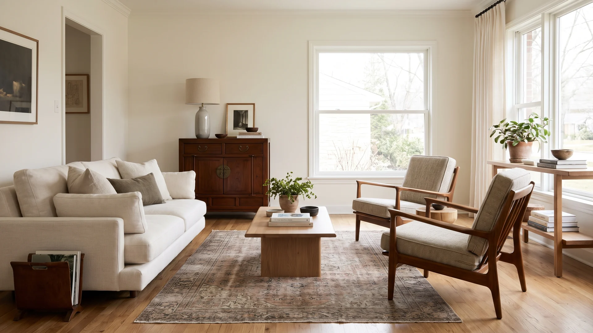
Check scale before provenance
A meaningful antique still has to work physically in the room. Measure seat height, table height, clearance and visual weight. Respect for an object includes using it in a way that does not force it into an unsuitable function.
Let furniture share one practical dimension
Eclectic rooms feel more coherent when mismatched pieces still agree on the dimensions that matter. Side tables should reach the arm of a chair; dining chairs should work with the table height; a stool used as a table should be stable enough for a drink. That practical alignment allows materials and eras to vary much more freely.
When combining an antique or handmade piece with contemporary furniture, check how it will be used before assigning it a new job. Some objects are better displayed than repeatedly sat on, leaned against or exposed to hot cups.
Use baskets where they genuinely solve storage
Handwoven baskets can be beautiful and useful, but they become cliché when every corner receives one simply to signal a style.
Give each basket a job
A large floor basket can hold blankets; a sturdy handled basket can collect toys; a smaller one can organize magazines or remote controls. The storage function helps the object remain part of everyday life rather than decorative inventory.
Keep food and damp storage material-appropriate
Natural fibers react to moisture and residue differently. Do not use a decorative basket for wet towels, food or planters unless the material and lining are suitable. A beautiful handmade object lasts longer when its use respects the material.
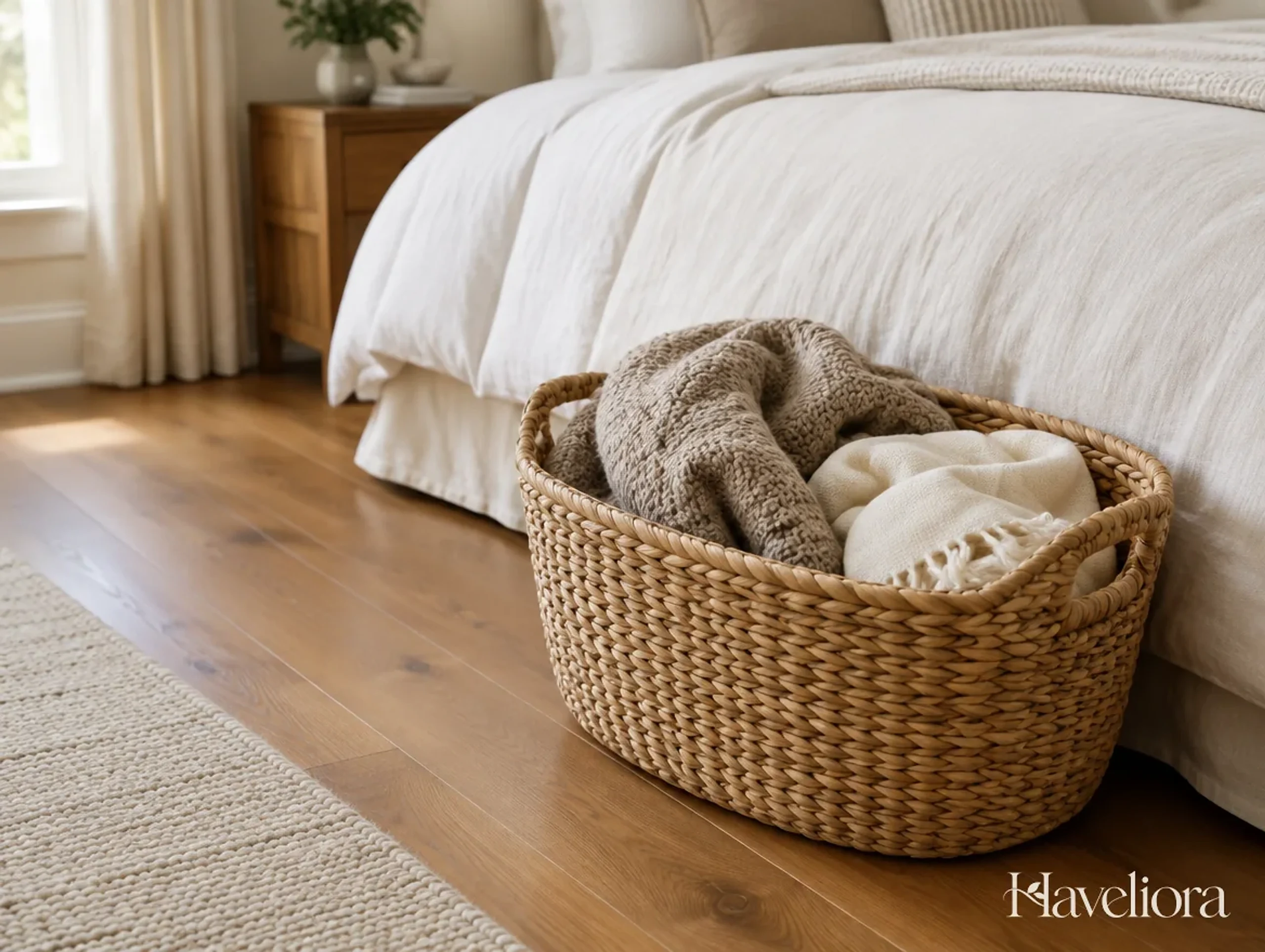
Use woven storage in a way that preserves its shape
Overfilling a basket with heavy books, sharp toys or wet towels can distort fibers that were designed for lighter use. Match the object to the job. A rigid basket may hold blankets or magazines; a softer open weave may be better for lightweight textiles; a lidded piece can conceal small household items if opening it repeatedly does not strain the lid.
If a handmade basket is valuable, consider using a simpler commercial bin inside a cabinet for messy storage and letting the handmade piece serve a gentler function where it can last longer.
Source with curiosity and respect
Trend cycles can create sudden demand for objects whose cultural context gets stripped away in mass-market copies. Slowing the buying process is one of the best ways to keep the room personal.
Prefer documented makers and sellers
Look for artist names, workshop information, place of origin and material details. Fair-trade organizations, artist-run platforms, reputable galleries and specialist vintage dealers often provide more context than generic marketplace listings.
Avoid invented origin stories
If you do not know where an object came from, describe what you can verify: material, construction, approximate age if known and where you found it. Do not assign a country, ethnic group or symbolic meaning based on appearance alone.
Buy fewer stronger pieces
One textile with a story, one artwork you love and one excellent basket can create more depth than a cart full of trend accessories. This also makes the room easier to edit when tastes change.
Ask the seller useful questions
When buying directly from a maker, gallery or specialist dealer, ask about material, technique, origin, approximate date and recommended care. If a vintage dealer cannot identify the maker, that is not automatically a reason to reject the piece, but it is a reason to avoid repeating a confident cultural attribution that cannot be supported.
Mass-market products inspired by a tradition should be described honestly as contemporary reproductions or design references rather than presented as authentic heritage objects. That distinction helps keep craft history separate from retail styling.
Keep the room functional beneath the layers
A layered interior still needs clear circulation, usable tables, comfortable seating and practical light. Styling should not occupy the surfaces that daily life requires.
Protect clear table space
Leave enough room on a coffee table for drinks, books or a laptop. Decorative bowls and objects should be easy to move or small enough that they do not turn every surface into a display.
Use lighting at several heights
Table lamps, floor lamps and wall lights can illuminate woven textures and artwork more gently than a single bright ceiling fixture. Choose shades and bulb temperatures that render deep blues, warm woods and natural fibers accurately after sunset.

Keep pathways calm
Layering rugs, stools and baskets around the perimeter can gradually narrow a room. Walk the normal routes carrying a tray or laundry basket and remove anything that repeatedly becomes an obstacle.
Keep comfort as the editing rule
Before adding another stool, floor cushion or basket, ask whether the room has gained a useful place to sit or store something—or simply another object to navigate around. A comfortable sofa, supportive chair and reachable table are more important than achieving a particular number of “layered” elements.
Rugs also need to lie flat and remain secure in walking routes. A beautiful handwoven piece can be displayed elsewhere if its texture or fringe creates a trip hazard in the busiest part of the room.
Adapt the idea to different rooms
The trend does not require a whole-house makeover. A single room or corner can carry the approach more convincingly than repeating the same motifs everywhere.
Living room
Use one major textile or artwork, a neutral comfortable sofa, a natural-fiber rug and a mix of wood and woven storage. The living room can handle the fullest expression because it has enough furniture to distribute the layers.
Bedroom
Keep the bedding relatively calm and let a textile at the foot of the bed, artwork or one upholstered chair carry pattern. Too many active prints around the sleeping area can undermine the restful effect.
Dining area
A solid wood table, woven pendant and one textile or art piece may be enough. Preserve the table surface for meals instead of filling it with permanent decorative collections.
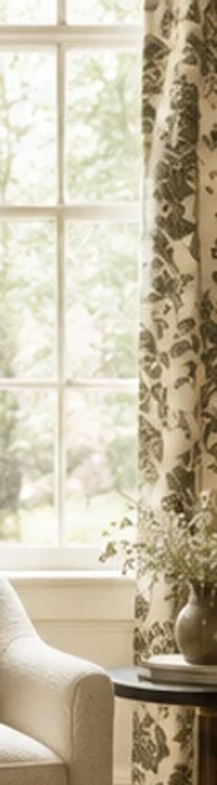
Change the density by room function
A living room can tolerate more visual information because people spend time looking at art, books and textiles there. A bedroom usually benefits from fewer active surfaces around the bed. An entry needs stronger circulation and less floor clutter. A dining room needs a table that can actually be cleared for meals.
Using the same editing principle across rooms creates continuity without repeating the same basket, textile and color formula everywhere. The house can feel related while each room responds to its own activity.
Use architecture as the quiet frame
Older homes with plaster, timber floors or traditional trim already have texture and history. Modern apartments may have cleaner lines and fewer built-in details. The Afrohemian approach can work in both when the decorative layers respond to the architecture rather than covering it.
In traditional rooms
Let original woodwork, moldings or fireplaces remain visible. Contemporary art and restrained woven layers can prevent the room from feeling like a historical reconstruction.
In modern rooms
Use a few handmade or vintage elements to soften smooth walls and simple cabinetry. One irregular ceramic, handwoven rug or carved stool can create contrast without forcing faux age onto the architecture.
For another way to combine historic and contemporary references, see Haveliora’s new traditional interior ideas.
Let original architecture do part of the decorating
If the home has exposed timber, old plaster, brick or patterned tile, consider those existing materials part of the layered composition. Adding many new textures on top can obscure the character already present. In a newer home, the quiet architecture may instead give one expressive textile or artwork more power.
Avoid fake architectural aging simply to make the style feel more “authentic.” Patina is most convincing when it belongs to real materials and real use rather than surface distress added to every new object.
Use books and records to add context naturally
Books about artists, textiles, architecture or places can sit in the same room as the objects they help you understand. They should be books you actually want to read, not props arranged solely by spine color. A small stack on a side table can make the room more informative while still serving everyday use.
Music, photography and exhibition catalogs can also broaden the room’s references beyond decorative objects. The goal is a home shaped by curiosity, not a surface-level visual category.
Edit before adding another pattern
The easiest way for this style to become cluttered is to interpret “layered” as “more.” Editing keeps individual objects meaningful.
Use the three-distance test
Look at the room from the doorway, from the main seat and from close range. At the doorway, the large shapes and color distribution should feel calm. From the sofa, the art and textiles should have clear relationships. Up close, texture and craft can provide detail. If every distance reads as equally busy, remove one layer.
Rotate rather than display everything
Textiles, baskets and small art can be stored and rotated seasonally. This gives the collection room to grow without turning the home into a permanent showroom.
Photograph the room before buying the next object
A phone photograph can reveal pattern density more clearly than standing inside the room because it compresses the composition into one frame. If the photo already has several strong focal points, the next purchase may need to be quiet and functional rather than another statement piece.
Try removing one object before adding one. This simple exchange keeps surfaces usable and helps a growing collection feel intentional. The goal is not minimalism; it is enough breathing room for the pieces with the most meaning.
Use plants as living material rather than cultural shorthand
Plants can soften wood, plaster and woven fibers, but they do not need to be chosen to create an imagined “tropical” identity. Select species for the light and care conditions of the room. A healthy plant in a simple ceramic pot contributes more to the interior than several struggling plants added only because greenery appears in trend imagery.
Keep watering practical around handmade baskets, rugs and wood furniture. Use saucers or liners where needed so moisture does not damage the materials that give the room its depth.
Keep the look useful after the trend passes
The most durable version of Afrohemian design is built from objects that would still matter without the 2026 label. A documented textile remains a textile with cultural and craft value. A useful basket remains storage. An artwork remains the work of an artist you chose. A well-made chair remains comfortable furniture.
Avoid painting permanent motifs, buying novelty signs or replacing functional furniture solely to match a trend forecast. Use the trend as permission to explore makers, materials and art you may not have considered, then let your actual collection—not the trend name—determine the finished room.
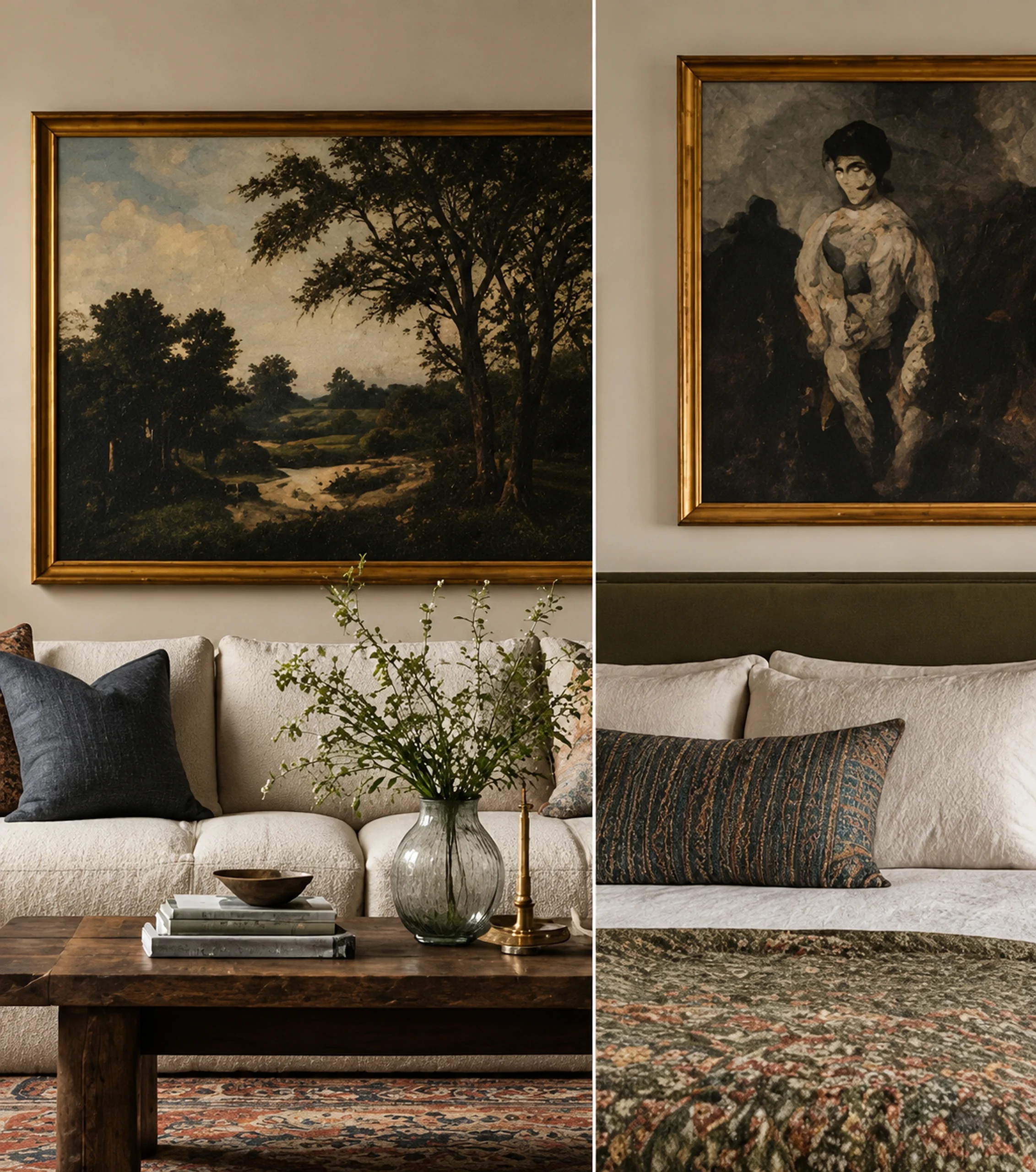
Build slowly enough for the room to become yours
Rooms assembled over several years often feel more convincing than rooms completed in one shopping weekend because the objects have different origins, ages and stories. Leave gaps. Use what you already own. Let a new artwork change the balance before deciding what should be purchased next.
This slower process is also more compatible with respectful sourcing. It gives you time to learn about makers and techniques rather than buying a generic approximation because a trend suddenly made a visual category popular.
Separate cultural context from personal association
An object can have two stories at once: where and how it was made, and what it means to the person who owns it. Preserve both. A textile bought while traveling may carry personal memory, but that does not replace its cultural or craft context. Likewise, an inherited basket can be important to a family even when its maker is unknown.
That dual attention makes a collected room richer. It allows objects to participate in everyday life without erasing the people, techniques and places connected to their creation.
Final perspective
Afrohemian decor is most interesting when it stops behaving like a theme. Begin with specific objects, learn what they are, and give them enough visual space to remain themselves. Mix eras, pair expressive textiles with quiet materials, source art with context, and use baskets and furniture for real jobs. The room can feel relaxed and richly layered without implying that many distinct African traditions are one interchangeable aesthetic.
If the design still works after the word “Afrohemian” is removed, the room is on stronger ground. What remains should be a comfortable home shaped by objects with material presence, personal meaning and enough context to be appreciated rather than simply consumed as a trend.
Other Articles
FunHaus Decor Ideas for Playful Rooms That Still Feel Designed
Hidden Laundry Ideas for Small Homes and Multipurpose Rooms