Chocolate brown is becoming one of fall 2026’s most useful decorating colors because it creates seasonal warmth without requiring a house full of orange pumpkins. Current design coverage is treating cocoa, espresso, tobacco and dark walnut tones as flexible neutrals that can work with cream, pale blue, ochre, olive, burgundy, natural timber and aged brass. Homes & Gardens includes chocolate among the season’s strongest color directions, while recent retail and editorial collections are extending the palette through rugs, textiles and furniture rather than novelty fall accessories.
The advantage is longevity. A cocoa wool throw can stay out through winter. A walnut side table is useful all year. Amber glass can move from a fall dining table to a shelf in January. The most convincing version of the trend uses brown to deepen materials already present in the home, then adds a few seasonal layers that are easy to rotate. See Homes & Gardens’ fall 2026 color trend coverage for current context.
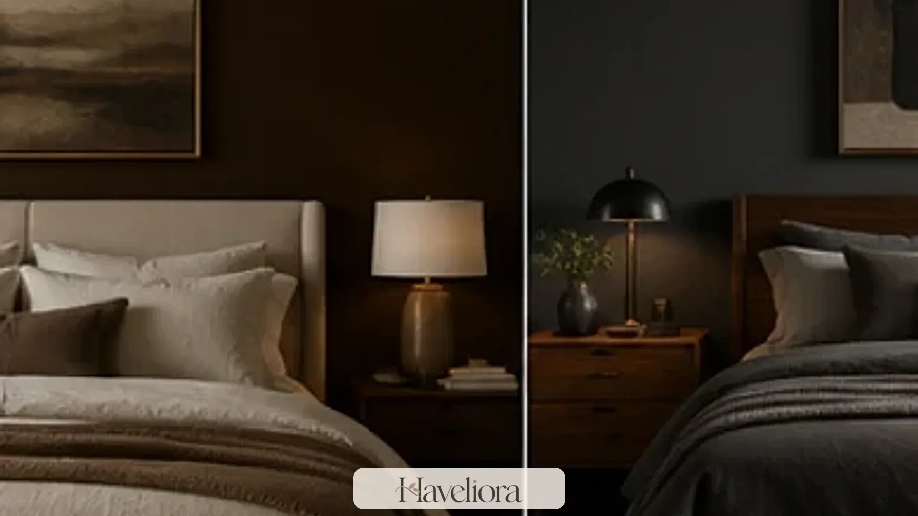
Treat chocolate brown as a neutral, not a theme color
Brown becomes easier to use when it is approached like navy, charcoal or camel: a grounding color that can support many other shades rather than a decorative motif that needs to be repeated everywhere.
Use one substantial brown element
A rug, armchair, blanket, cabinet or pair of curtains can establish the palette. Once a large brown area exists, smaller objects do not need to match it exactly.
Vary the brown tones
Espresso, cocoa, tobacco, caramel and natural walnut can coexist because real materials already contain variation. Avoid trying to match every wood and textile to one flat dark-brown swatch.
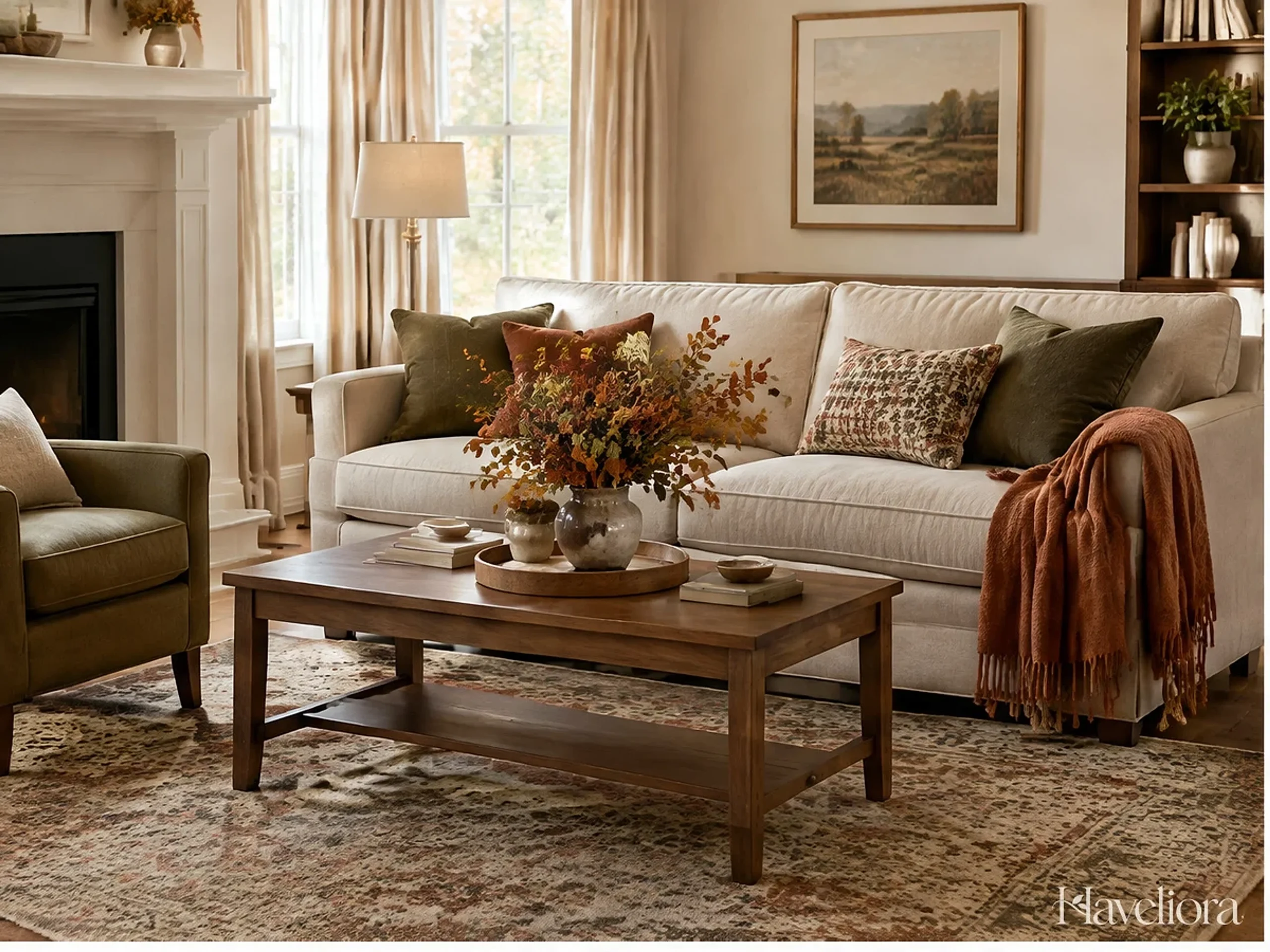
For a broader seasonal approach that avoids disposable themed decor, see Haveliora’s fall home decor ideas.
Choose the undertone that already exists in the room
Chocolate brown can lean red, yellow, gray or almost black. Compare the new textile with the floor, largest wood furniture and wall color before deciding which version works. A red-brown throw may look rich beside walnut but unexpectedly orange next to a cool gray sofa. A more neutral espresso can bridge cool and warm materials but may become nearly black in low light.
Carry samples around the room during the day. The goal is not an exact match; it is avoiding a brown whose undertone fights every permanent surface around it.
Start with textiles that can rotate seasonally
Textiles are the fastest way to add depth without committing to paint or furniture. Use layers people will actually touch and use.
Wool and brushed throws
A cocoa wool throw over a cream sofa or bed creates immediate contrast and warmth. Choose a weight that suits the room rather than an excessively chunky knit that is difficult to wash or store.
Velvet in small doses
Chocolate velvet absorbs light and can make a chair or cushion feel richer at night. Because the material already has visual depth, one or two velvet pieces are usually enough.
Linen and cotton for lighter rooms
If the home receives limited daylight, brown linen or a fine stripe can introduce the color without creating the visual weight of heavy wool or velvet.

Layer texture before adding more color
If a sofa already has a cocoa throw, the next seasonal change can be a cream bouclé cushion, ribbed wool or woven linen rather than another brown item. Variation in texture makes a limited palette feel richer and keeps the room from looking like a set assembled from one fabric collection.
Use the softest, most tactile materials where people touch them. Decorative texture that looks cozy but scratches, sheds or cannot be cleaned easily tends to become clutter rather than comfort.
Pair cocoa with cream to protect contrast and daylight
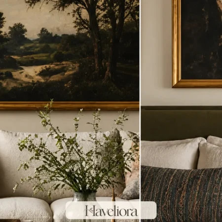
Cream, ivory and warm white keep chocolate brown from becoming oppressive, particularly in smaller rooms or spaces with dark flooring.
Let pale upholstery remain the largest light surface
A cream sofa can carry a cocoa throw and one dark cushion while still reflecting daylight into the room. Avoid replacing every pale layer simply because the seasonal palette is deeper.
Use warm white rather than icy contrast
Very cool white can make warm brown appear flatter or redder. Test paint, textiles and lamps under the actual room lighting before deciding which pale neutral creates the best transition.

Use cream in the places that reflect the most light
Light curtains, lampshades, a large rug or the main sofa reflect more daylight than a handful of pale accessories. If the room is starting to feel heavy, protect those larger light surfaces instead of adding small white objects around the edges.
This is especially useful in a living room with a chocolate chair and dark wood casegoods. The contrast can feel intentional when the floor or upholstery offers a generous light plane between the darker forms.
Mix brown with olive, burgundy and ochre carefully
These colors work because they share some of brown’s warmth and depth, but using all of them at equal strength can make a room look heavily autumnal.
Chocolate and olive
Olive adds a botanical quality and works particularly well with walnut, oak and cream. Use it in one throw, ceramic lamp or upholstered seat instead of covering several surfaces.
Chocolate and burgundy
Burgundy increases the richness of the palette. A single cushion, artwork detail or table linen is usually enough to create the connection.
Chocolate and ochre
Ochre can brighten brown, especially in rooms with warm wood. Choose muted mustard or golden ochre rather than a very bright yellow if the goal is a more grown-up fall palette.

Assign secondary colors clear roles
Rather than scattering olive, burgundy and ochre evenly, decide which one belongs to textiles, which appears in art or ceramics, and which might not be needed at all. A brown-and-cream room with one olive blanket often feels more sophisticated than a room trying to display every fall color trend at once.
Secondary colors also need different proportions. A small burgundy cushion can have the same visual weight as a much larger muted olive throw because burgundy is deeper and more saturated.
Use pale blue when the room needs relief
One of the most useful ways to keep chocolate brown from feeling predictable is to introduce a cooler note. Pale blue, smoky blue-gray or a restrained denim tone can make the brown look cleaner and more contemporary.
Use blue in materials that already belong in the room
A blue-gray ceramic lamp, patterned textile or artwork can add cool contrast without creating a separate color scheme. The blue should feel like part of the room’s existing vocabulary rather than a seasonal accessory purchased only for fall.
Keep the temperature balanced
If the walls, floor and furniture are all warm, even a small amount of cool color can provide visual air. If the room already has cool gray walls, use cream and wood between the gray and chocolate so the combination does not become harsh.
Use cool color near the darkest brown
Pale blue is particularly effective beside very dark espresso or chocolate because the temperature contrast helps the edges of furniture remain visible. A blue-gray ceramic lamp on a walnut chest or a small blue detail in artwork above a brown sofa can keep the composition from merging into one warm block.
Do not feel obligated to repeat the blue several times. One well-positioned cool note can be enough if the room already has visual balance.
Let real wood provide some of the brown
Wood is one of the easiest ways to participate in the color direction without buying new brown decor.
Use existing walnut or oak first
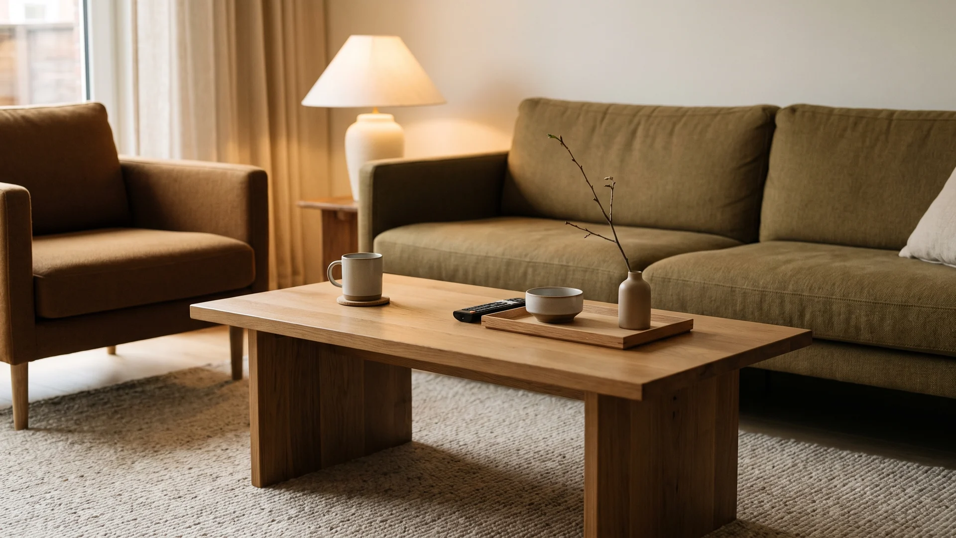
Clear unnecessary objects from a wood console or table and let the grain become part of the palette. A seasonal branch arrangement or amber lamp may be all that is needed to make the surface feel intentionally autumnal.
Do not force every species to match
Medium oak, dark walnut and a small amount of blackened wood can work together when their proportions are balanced. Connect them through repeated undertones, upholstery or metal rather than staining every piece the same shade.

If you want to work with the wood already in the home, Haveliora’s fall living room ideas goes deeper into layering seasonal textiles around permanent furniture.
Let wood grain count as pattern
Highly figured walnut, oak or burl already adds movement. If the room has a strong wood coffee table, simplify the rug or nearby textiles instead of layering several additional prints. This helps the brown palette feel material-led rather than decorated.
Condition and maintain wood according to the finish it already has rather than applying dark stain simply to follow the trend. Existing furniture can contribute seasonal depth without being permanently altered.
Add amber and smoky glass for light rather than clutter
Translucent brown is especially effective because it adds color without creating another opaque mass.
Amber lamps and vases
An amber glass lamp can warm a corner even when it is switched off. A simple vase catches window light and makes the seasonal palette feel lighter.
Smoked glass on the dining table
Smoky tumblers or a low vase can bring brown to a table while keeping sightlines open. Choose glassware you will actually use rather than pieces that exist only as seasonal display.
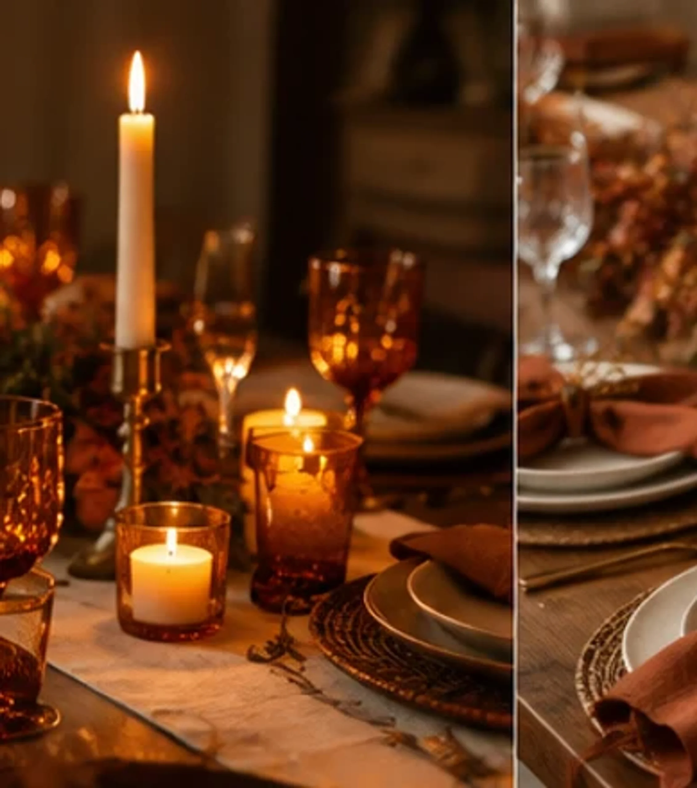
Keep translucent objects where they catch real light
Amber and smoked glass are most useful near a window, lamp or open shelf where light passes through them. A brown glass vase placed in a dark corner may read as another opaque dark object; the same vase beside a pale wall can glow and lift the palette.
Limit the collection. Two useful amber tumblers and a lamp can create more atmosphere than a shelf crowded with seasonal bottles and jars.
Use black as punctuation, not the second dominant color
Chocolate brown and black can look sophisticated together, but too much of both can flatten a room, especially after sunset.
Keep black narrow
Thin picture frames, a lamp stem, a small side table or cabinet hardware can sharpen the palette without creating large dark blocks.
Separate black from brown with light material
A cream wall, pale rug or linen lampshade can sit between a dark brown chair and black metal table, preserving the difference between the two colors.
Check whether black already exists in the architecture
Window frames, a fireplace insert, television screen or black metal doors may already provide all the dark punctuation the room needs. Adding black lamps, frames and tables on top of those features can make the space feel more graphic than intended.
Repeat an existing black line once if connection is needed, then let chocolate brown remain the softer dark neutral. The distinction between the two is part of what gives the palette depth.
Adjust the lighting as the palette becomes deeper
Seasonal decorating often happens at the same time daylight hours become shorter, so the lighting plan affects whether dark brown feels cozy or heavy.
Use several low light sources
Table lamps, floor lamps and shaded sconces create softer pools of light than one intense ceiling fixture. They also reveal the texture in wool, wood and velvet.
Let lampshades stay light
A cream linen shade can brighten a dark corner and keep the color of the lamp base from dominating. Very dark shades create dramatic pools of light but may not suit a room that already has several brown surfaces.
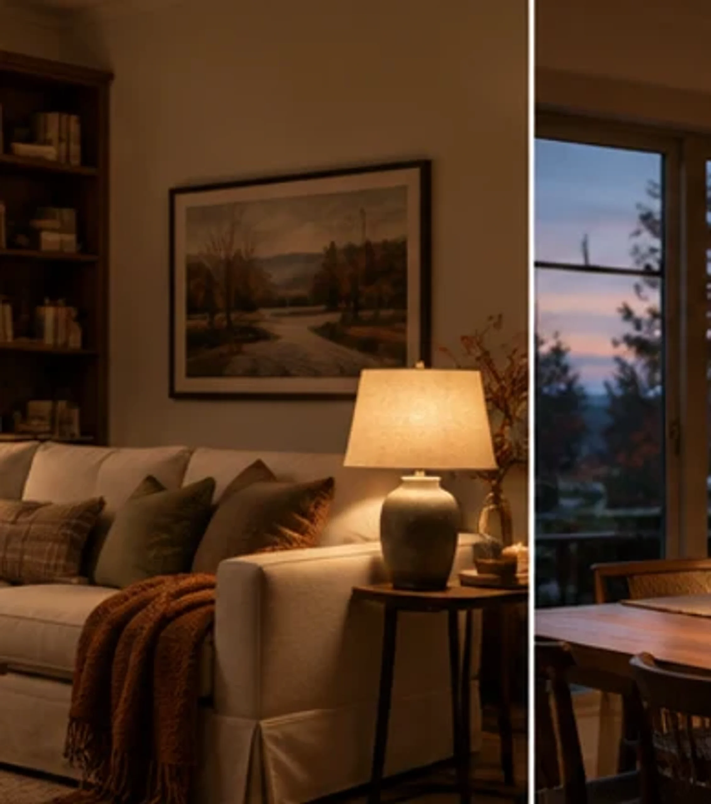
For more on changing atmosphere without adding more decorative objects, see Haveliora’s fall lighting ideas.
Choose bulb placement before adding darker shades
A dark brown lampshade can create beautiful focused light but may reduce the general brightness of the room. Use it where task light is not the only source and keep at least one pale shade or wall light nearby. The goal is a warm evening room in which faces, books and pathways remain comfortably visible.
Dimmer controls are useful because deeper colors often need more light during practical tasks and less during quiet evening use. Lighting flexibility is more effective than compensating with additional reflective decor.
Bring chocolate brown into the dining area without covering the table
A fall table should remain usable for food, serving pieces and conversation. Use the color in practical items instead of building a permanent centerpiece.
Brown linen napkins
Chocolate or tobacco linen napkins add color at every place setting and can be folded away after the meal. Pair them with cream plates and clear or amber glasses.
Low branches and seed heads
A few seasonal branches in a low vessel can add natural brown and green without blocking sightlines. Avoid brittle arrangements that shed directly over plates.
Wooden serving pieces
Boards, bowls and serving utensils contribute to the palette while doing real work. Let functional objects supply some of the seasonal material.
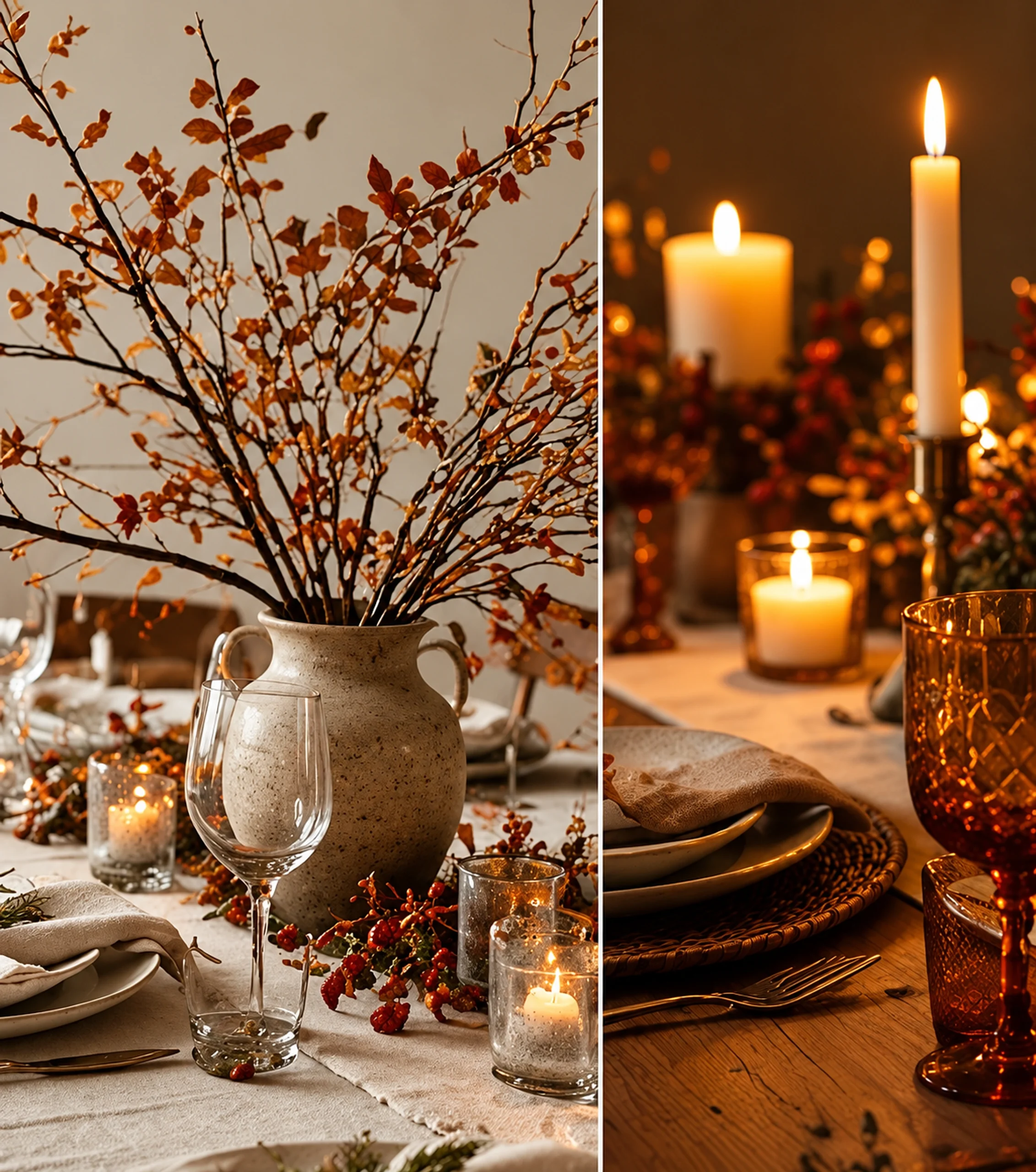
Haveliora’s fall table decor ideas provides a complete approach to keeping the table festive and usable.
Keep the center of the table visually low
Chocolate napkins, wood serving bowls and smoky glass already create enough color at place-setting height. A low branch arrangement or small vessel can complete the seasonal mood without building a tall brown centerpiece that blocks conversation.
Leave a generous central area empty when the table is used for serving. A usable dining table looks more welcoming than one where guests must move decorative objects before a meal can begin.
Use the palette differently in a bedroom
Bedrooms can handle chocolate brown beautifully because the color can create enclosure, but the balance between dark and light becomes important around the bed.
Start at the foot of the bed
A folded cocoa blanket or brown quilt at the foot introduces depth without replacing the entire bedding set. Keep the sheets and upper bedding light if the room is small.
Use wood and lamps for permanent warmth
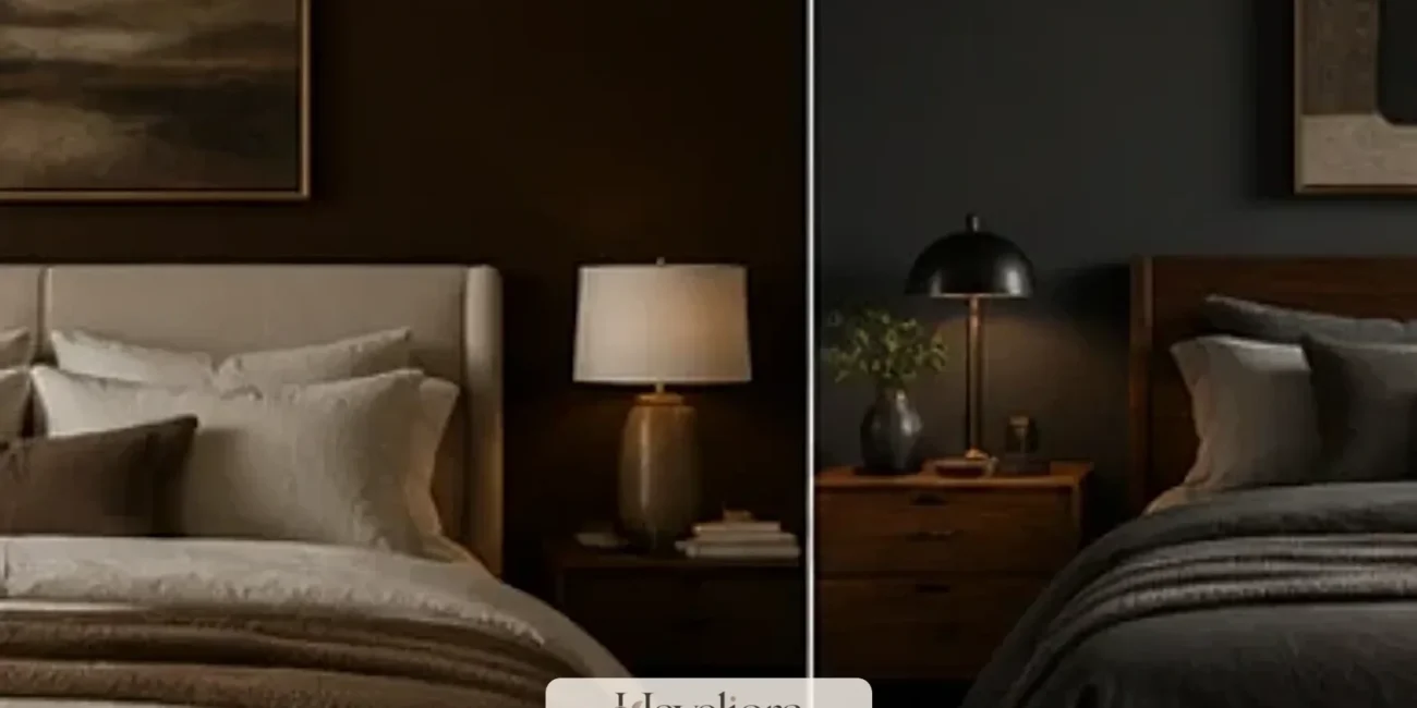
A walnut nightstand, amber lamp and warm rug can carry the palette after the seasonal blanket is stored. This makes the fall refresh feel integrated rather than temporary.
Avoid blocking the morning light
Heavy brown curtains may be beautiful in a bright room but overwhelming in one with a small window. Consider lighter linen curtains and use brown in bedding instead.
Use dark brown where visual enclosure is welcome
A headboard, blanket or wall behind the bed can carry more depth than the window wall because the darker color reinforces the sleeping zone without reducing incoming light. In a large bright bedroom, a chocolate painted wall may work well; in a smaller room, textiles can create the same effect with less commitment.
Keep bedside lighting warm and adequate for reading so the darker layers do not make the bed feel like a shadow after sunset.
Keep natural light unobstructed
Dark seasonal colors look best when daylight still reaches the room. Before buying another brown object, check whether existing curtains, furniture or plants are already reducing the window opening.
Pull large furniture away from the glass where possible, keep window treatments easy to open fully and use mirrors only where they reflect useful light rather than clutter.
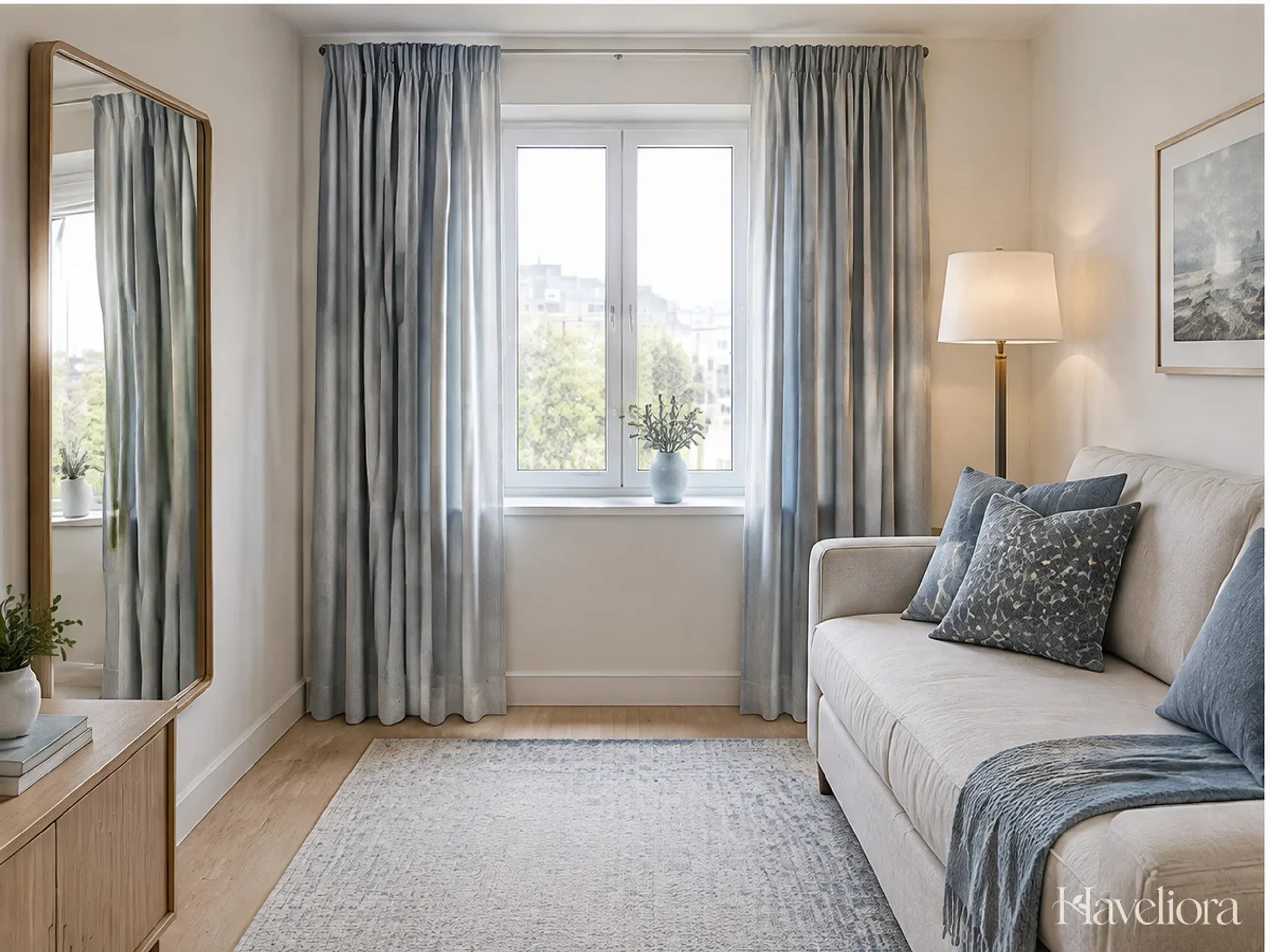
In a north-facing or deeply shaded room, use the deepest browns lower in the space—rug, bench, throw—and preserve pale walls and lampshades higher up.
Use the window as a brightness test
Stand at the room entrance on an overcast afternoon. If the window is the only bright area and all the furniture reads as one dark mass, remove or lighten a layer before adding anything else. Opening curtains fully, moving a tall plant or replacing one dark cushion with cream can make more difference than a decorative mirror placed where it reflects no useful daylight.
Seasonal depth works best when the room still has a clear range from light to dark.
Use brown in the entry with restraint
An entry can carry the seasonal palette through one practical element: a dark wood tray, tobacco-colored runner, cocoa bench cushion or brown ceramic lamp. Keep the landing surface clear enough for keys and mail rather than adding several decorative objects simply because the space is the first thing guests see.
If the entry lacks natural light, use the deepest brown at floor or furniture level and keep the wall and lamp shade lighter. This preserves the warm effect without making a small vestibule feel closed in.
Avoid disposable fall decor by changing texture instead of theme
A home can feel seasonal without pumpkins, slogan signs and objects that spend most of the year in storage.
Rotate cushion covers, not whole cushions
Store flat fabric covers and reuse the same inserts. This reduces storage volume and makes it easier to invest in better textiles.
Use branches, not a collection of figurines
A branch from a permitted source, seasonal foliage from a florist or a simple bowl of fruit can create a temporary autumn cue without adding another permanent object to store.
Move existing objects
An amber vase from a bedroom, a dark ceramic bowl from a shelf or a wool throw from another room may create enough seasonal change without purchasing anything new.
Store seasonal textiles in a way that protects them
Clean wool and linen before storing them, follow the care label and use breathable storage where appropriate. A high-quality brown blanket can return for many seasons if it is not packed away damp or dirty. Label a small seasonal textile box rather than dedicating storage to bulky novelty objects.
This practical storage limit can also guide buying: if a new fall item does not fit the small rotation space, something else should leave.
Repeat the palette through useful materials, not matching sets
A walnut serving board in the kitchen, a cocoa throw in the living room and brown linen at the dining table can connect the house without purchasing a coordinated fall collection. Their materials and functions differ, which keeps the repetition subtle.
Use the same principle between rooms: repeat one brown family or one metal finish, then let each room keep its own lighter colors and textures. A house feels more layered when seasonal continuity is loose rather than perfectly matched.
Keep the room balanced as the season progresses
Fall layers tend to accumulate. A new blanket arrives, then holiday decor follows, while the original summer accessories remain in place.
Use an exchange rule
When a deeper seasonal layer enters the room, remove one lighter decorative layer that is no longer serving the season. This keeps tables, shelves and seating usable.
Photograph the room at night
A quick phone photo after dark reveals whether dark furniture and textiles have merged into one large mass. If they have, introduce one lighter lamp, shade or textile rather than another decorative object.
Delay holiday layering until the fall room has been edited
When winter greenery, lights and ornaments arrive, remove some of the autumn-specific branches, table linens and extra pillows first. Chocolate brown can remain as the base because it works beautifully with evergreen, brass, burgundy and cream, but the room does not need the full fall and holiday layers simultaneously.
This exchange keeps shelves and seating functional and allows each seasonal phase to feel distinct without requiring a new color scheme.
Choose leather carefully if it already suits the home
Brown leather can deliver the palette permanently, but it should be chosen for comfort, quality and maintenance rather than as a seasonal shortcut. A leather chair or ottoman works best when the room already benefits from a durable wipeable surface. It does not need to be artificially distressed to feel autumnal.
Balance leather with softer materials such as wool, linen and a generous rug so the room remains warm rather than hard. If leather is not a material you would want year-round, use a removable brown textile instead.
Keep the look useful after the trend passes
Chocolate brown has staying power because it is already embedded in wood, leather, wool, stone and soil-colored ceramics. The trend becomes wasteful only when the color is translated into novelty purchases that have no role outside fall.
Invest in pieces you would keep in another season: a good walnut table, useful brown glassware, a wool blanket or one comfortable upholstered chair. Let temporary elements come from natural arrangements and easily stored textiles.
Use a one-week test before buying permanent brown furniture
If you are considering a large chocolate sofa, rug or wall color because of the trend, first live with a large brown throw, borrowed rug sample or painted board in the room for several days. View it in morning light, cloudy weather and evening lamps. A small seasonal layer can confirm that the undertone works before a more expensive permanent decision.
If the room feels richer rather than darker, a larger investment may make sense. If it feels heavy, keep chocolate brown as the removable seasonal accent and preserve the lighter foundation.
Build the fall palette from what is already brown
Before shopping, photograph the room and identify every existing brown element: floorboards, picture frames, wood furniture, woven baskets, leather, pottery and book spines. Many homes already contain enough of the color to support the trend. The seasonal work may simply be removing cooler summer accents and adding one richer textile.
This inventory prevents duplicate purchases and often reveals a more personal palette than a retail mood board. The room’s own materials should determine whether the final brown leans cocoa, caramel, walnut or espresso.
Use scent and color as separate decisions
Fall fragrance can make a room feel seasonal, but it does not need to be attached to a brown decorative object. Keep candles, diffusers or natural fragrance choices separate from the visual palette so the room can be edited for safety, allergies and preference without disturbing the design. A chocolate-colored vessel is not automatically more useful than a clear or cream one.
This separation also prevents a seasonal color trend from multiplying into matching candles, jars, trays and signs. Let brown live primarily in durable materials and textiles; fragrance can remain its own temporary layer.
Build the palette from what is already brown
Before buying anything, photograph the room and identify the brown that already exists in floorboards, picture frames, wood furniture, baskets, leather, pottery and book spines. Many homes already contain enough of the color to support the trend. The seasonal change may simply be removing a cool summer textile and adding one deeper throw or table linen.
Use a short test before committing to a large brown surface
If you are considering a chocolate sofa, rug or painted wall, live with a large fabric sample, borrowed rug sample or painted board for several days. Check it in morning light, cloudy weather and evening lamplight. If the room feels richer instead of darker, a permanent investment may make sense; if it feels heavy, keep chocolate brown in removable seasonal layers.
Final perspective
Chocolate brown is a strong fall color because it can deepen a room without turning it into a seasonal set. Use it as a neutral, protect pale surfaces and daylight, and let real materials—wood, wool, linen, glass and leather—supply most of the color. Pair it with cream first, then add olive, burgundy, ochre or pale blue only where the room benefits from another note.
The goal is warmth that remains useful. When the branches come down and winter arrives, the best brown layers should still belong in the house.
Other Articles

Christmas Bow Decor Ideas That Feel Elegant, Not Overdone
FunHaus Decor Ideas for Playful Rooms That Still Feel Designed