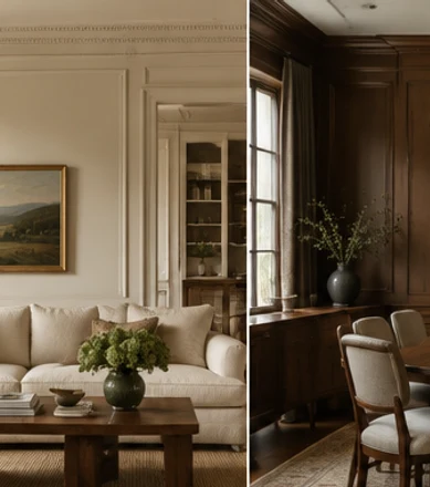

A neutral home does not need every wall, curtain, and sofa to match. In fact, repeating the same exact combination in every room can make the house feel less personal. A better goal is continuity: neighboring spaces share enough colors or materials to belong together while retaining the differences their functions require.
Think of the palette as a small vocabulary rather than a fixed recipe. Ivory, mushroom, oak, and dark bronze might appear throughout the home, but their proportions can change. The living room may emphasize upholstery, the kitchen cabinetry, and the bedroom quieter textiles.
These neutral home decor ideas focus on six decisions that help a whole-home scheme feel connected. They are especially useful when the furniture has been collected over time or when you are updating one room without renovating the others. Start with the permanent finishes and the views between spaces, then use samples and a few repeated details to build the relationships.
Create a connected neutral home
1. Choose a Shared Background, Not an Identical Room Formula
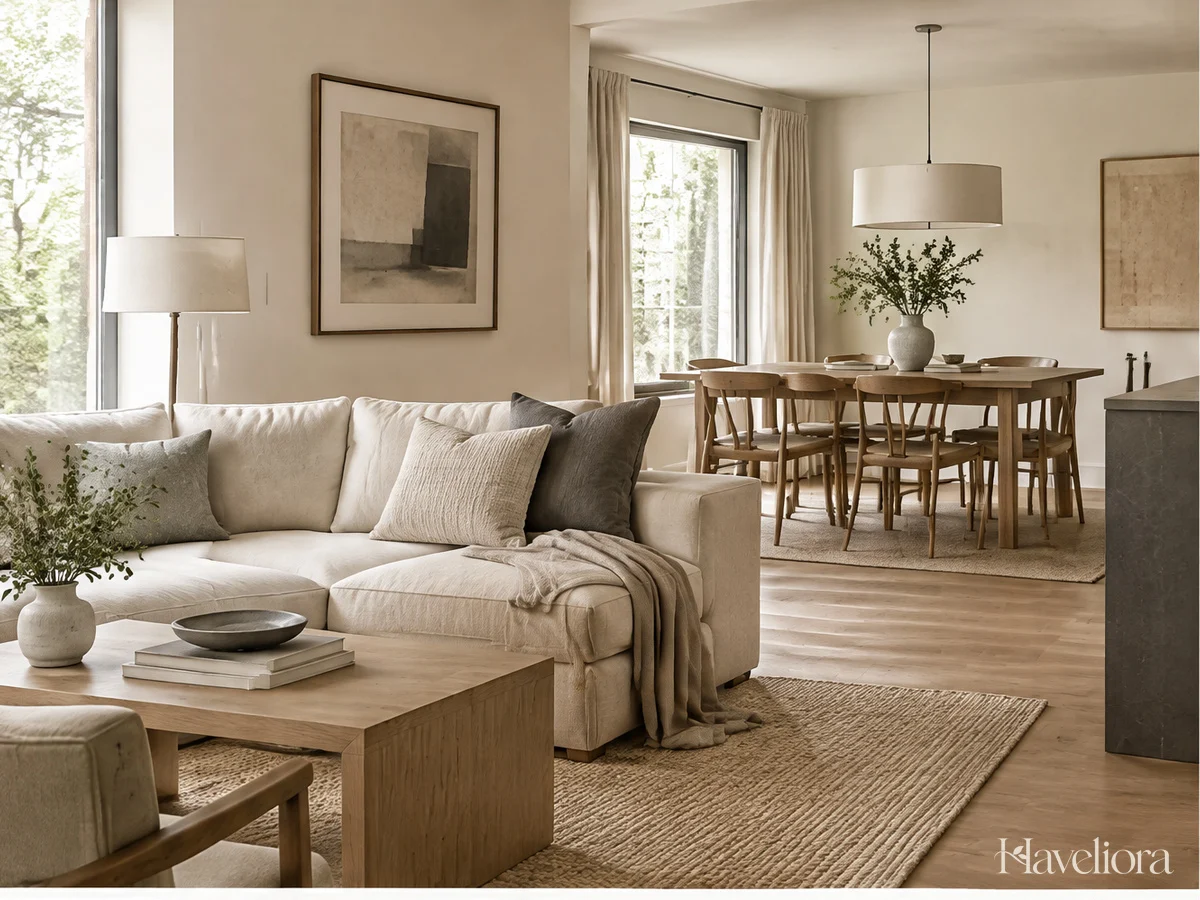
Start with a few colors and materials that can appear comfortably across the home. A warm light background, a supporting midtone, and one deeper finish provide a manageable starting point. The exact choices should relate to the floor, cabinetry, and furniture you plan to keep.
Allow the balance to change by room. A pale living room might use darker wood as an accent, while a dining room with an inherited wood table may reverse the emphasis. The connection comes from the shared family of finishes rather than identical quantities.
Do not assume one paint looks the same everywhere. Rooms receive different light and contain different neighboring surfaces. A color can still belong to the whole-home plan while appearing slightly different in each space. Test it where it will actually be used.
Keep strong accents selective. A small amount of olive, clay, or muted blue can appear in one room and be echoed more subtly in the next. You do not need to introduce the accent into every object for it to feel intentional.
Before creating a new palette, list the finishes already repeated in the home. Build from those natural connections before creating a completely new palette that would require replacing useful pieces.
2. Compare Undertones Beside the Surfaces That Will Stay
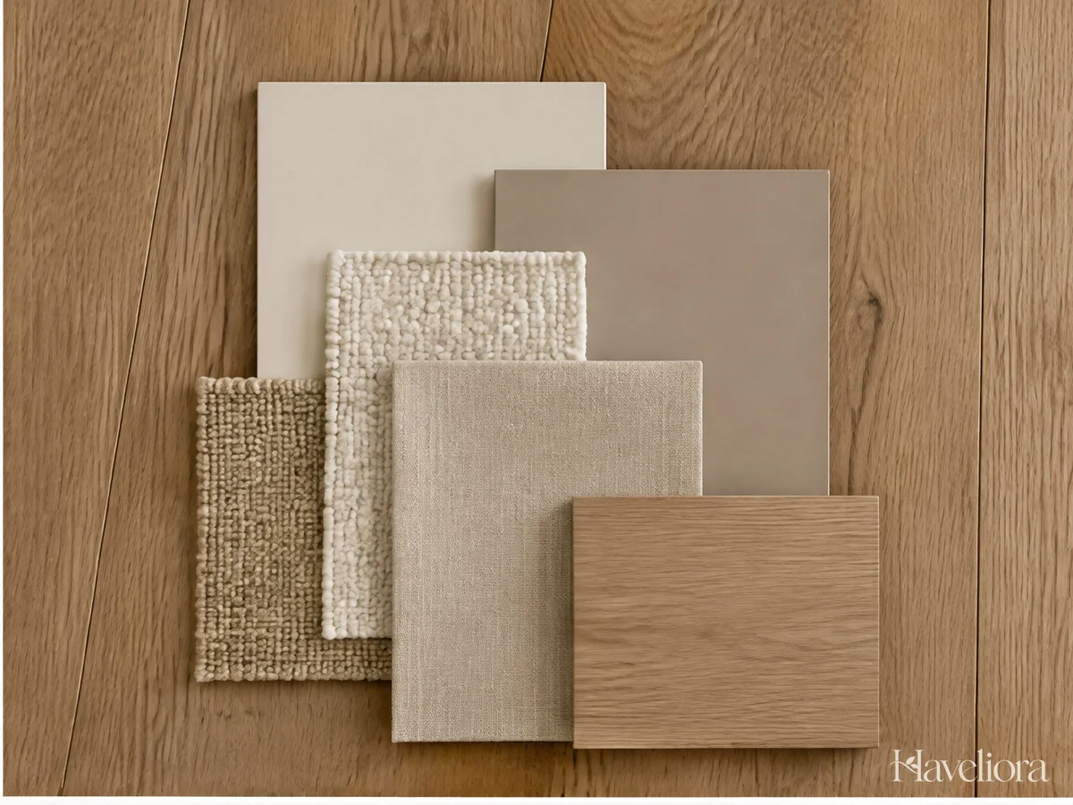
Neutral names are broad descriptions. Two products called stone can look noticeably different together, and a fabric described as ivory may not suit the particular white already in the room. Compare the actual materials instead of treating their names as a matching system.
Begin with the least changeable finish. Flooring, large cabinetry, and an expensive existing sofa deserve attention before a small cushion. Choose the more flexible details around those anchors rather than trying to make the entire home compensate for an ignored surface.
Move the samples between their proposed rooms. View them vertically and horizontally where appropriate, and check them in daylight and under the lights you use in the evening. A material that works beside one wall may need a slightly different supporting tone in another space.
Keep a small sample collection together while shopping. Include the main upholstery, a wood reference, and the proposed wall or curtain tone. Photographs can remind you of the room’s context, but use them cautiously for exact color decisions.
Do not overcorrect: small differences can create a richer scheme. The question is whether the combination feels deliberate to you, not whether every neutral has an identical undertone or value.
3. Give Each Room a Different Mix of Texture

A shared palette does not require a shared set of fabrics. The bedroom might emphasize softer bedding, the living room a durable upholstery and rug, and the dining area a simpler wipeable surface with a removable textile.
Contrast broad smooth areas with selected tactile details. A plain sofa can support a nubby cushion; a simple wall can make wood grain more noticeable. Avoid choosing every material at its most pronounced texture, which can create as much visual competition as several bold patterns.
Use material variety through practical pieces. A wooden table or a useful curtain contributes more naturally than many small decorative objects added solely to increase texture. Let the room’s functions carry the palette.
Check care requirements before repeating a material throughout the home. A delicate weave may suit a protected decorative cushion but be inappropriate for a heavily used dining seat. Visual continuity should not override the demands of each location.
In each room, choose one texture that leads in each space and let the others support it. This creates a family resemblance without making the rooms feel like copies of one another.
4. Judge the Scheme Through Doorways and Across Open Plans
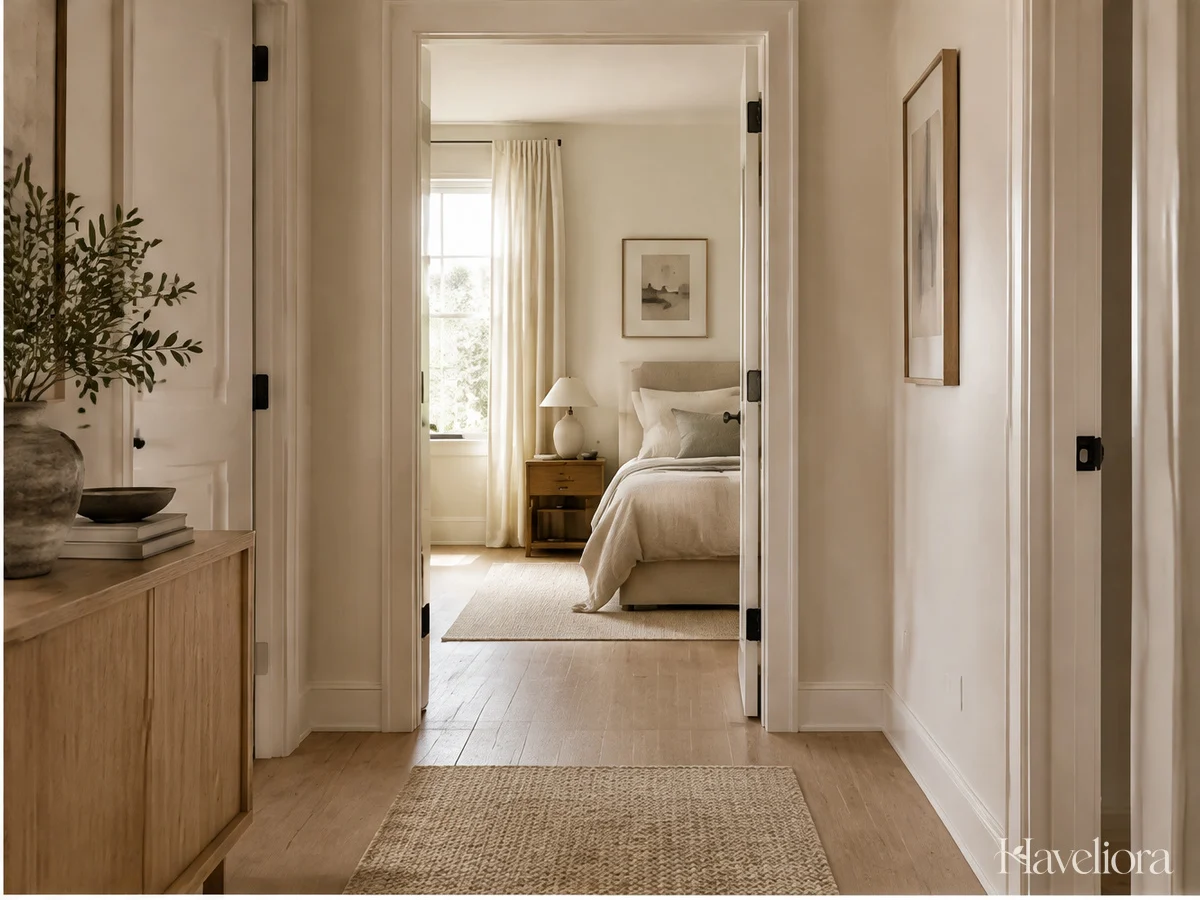
A room is rarely experienced only from its center. You see the bedroom from the hall, the kitchen from the dining table, and the living room while entering the home. Review those views before finalizing a whole-home scheme.
Look for one connection in each transition. A wood tone, a curtain color, or a darker frame may be enough to relate two spaces. The connection can be small when the architecture or floor already provides continuity.
Allow deliberate differences where the function changes. A bedroom may use a deeper wall tone while the hallway remains lighter. A kitchen may need harder, more practical surfaces than the neighboring living area. The palette can accommodate those differences without making the home feel fragmented.
In an open plan, avoid assigning a completely unrelated accent color to every zone. Use furniture orientation, rugs, and lighting to define activities while the broader material group stays connected. This can make the plan clearer without physical dividers.
To review the transitions, take a few images through the main doorways rather than only straight-on room pictures. Notice whether one unexpected surface dominates the transition. Adjust a small detail first before assuming the whole adjoining room needs changing.
5. Repeat a Deeper Note to Give the Home Definition

Light neutrals often benefit from a point of depth. Darker wood, bronze, charcoal, or a deeper version of the main neutral can define edges and give the arrangement a clearer structure.
Repeat that deeper note selectively. A lamp in one room might relate to a frame in the next, while a darker cabinet provides a larger anchor elsewhere. You do not need equal amounts in every space.
Consider the distribution within each room. If all the darker objects sit together, one area may feel visually heavy. Moving a small existing item can balance the composition more effectively than adding another large piece.
Choose the intensity you enjoy. Black can create a crisp contrast, but it is not mandatory. Brown or muted bronze may suit a softer scheme. Compare the finish with the surrounding materials instead of following a universal instruction to add black to every room.
From the doorway, identify the first dark element you notice from the doorway. If it is not something you intended to emphasize, change its position or reduce the contrast before adding more decorative detail.
6. Let Personal Objects Keep the Palette From Becoming Generic

A home can be perfectly coordinated and still feel anonymous. Keep room for the objects that matter to you: a handmade vessel, a book collection, a family piece, or an artwork you enjoy beyond its ability to match the sofa.
Place those objects deliberately. One meaningful piece with space around it can have more presence than several new accessories arranged to complete a neutral display. Let the object contribute its own shape and texture rather than hiding it in a crowded group.
Personal pieces with a practical role integrate easily. A favorite bowl can hold fruit or keys, and an inherited table can serve the chair where you read. Their everyday role helps the home feel lived in without requiring extra decoration.
Do not remove every color that falls outside the planned palette. A small unexpected detail can make a restrained room more individual. If it feels disconnected, try repeating a related tone subtly elsewhere instead of replacing the object.
Before you add another accessory, ask: does the finished room tell you anything about the people who live there? If not, add one meaningful detail before buying another coordinated ornament.
A Whole-Home Palette Without a Whole-Home Shopping List
Make an inventory of the major finishes you are keeping. Note which colors and materials already repeat, then choose a small shared group around them. This avoids planning a scheme that only works after expensive replacements.
Work on the most visible transition first. A hallway looking into the living room or a dining area beside the kitchen may benefit from one repeated finish or a calmer textile. Small changes in those views can establish continuity quickly.
Then refine each room according to its function. The bedroom can remain softer, the kitchen more practical, and the living area more layered. The shared palette should make decisions easier rather than force every space into the same arrangement.
For a more edited approach, explore warm minimalist decor. For a room-specific application, see neutral bedroom ideas.
Frequently Asked Questions
Should I use the same paint in every room?
You can, but it is not required. Test how the color behaves with each room’s light and fixed finishes. Related colors can create continuity while allowing individual rooms to feel different.
Can different wood tones work in a neutral home?
Yes. Give one tone the main role and repeat another in a smaller detail. Compare the actual finishes and allow textiles or painted surfaces to separate woods that feel too similar without quite matching.
How do I keep neutral decor interesting?
Vary depth, texture, and shape, then include a few personal objects. You do not need constant new colors, but a small accent is welcome when it supports the result you enjoy.
A connected neutral home is a set of related rooms, not identical rooms. Use the palette as a guide, let each space serve its own routine, and preserve the details that make the home personal.
Other Articles

Cozy Luxury Decor Ideas Built Around Comfort and Thoughtful Details
Warm Minimalist Decor Ideas for a Home That Still Feels Personal